First Sensor Website
Description
First Sensor Website
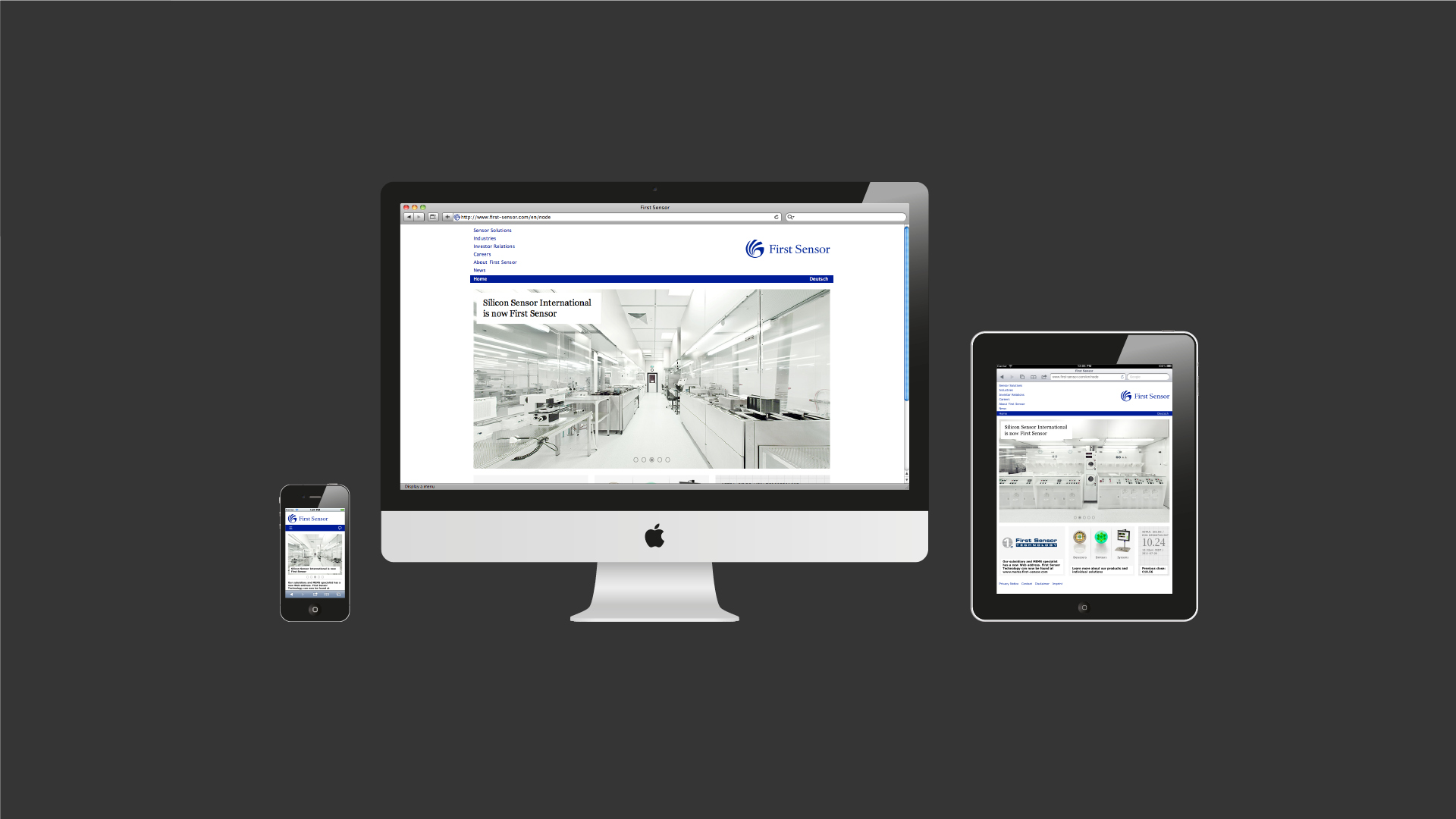
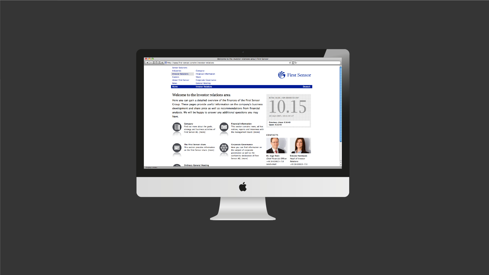
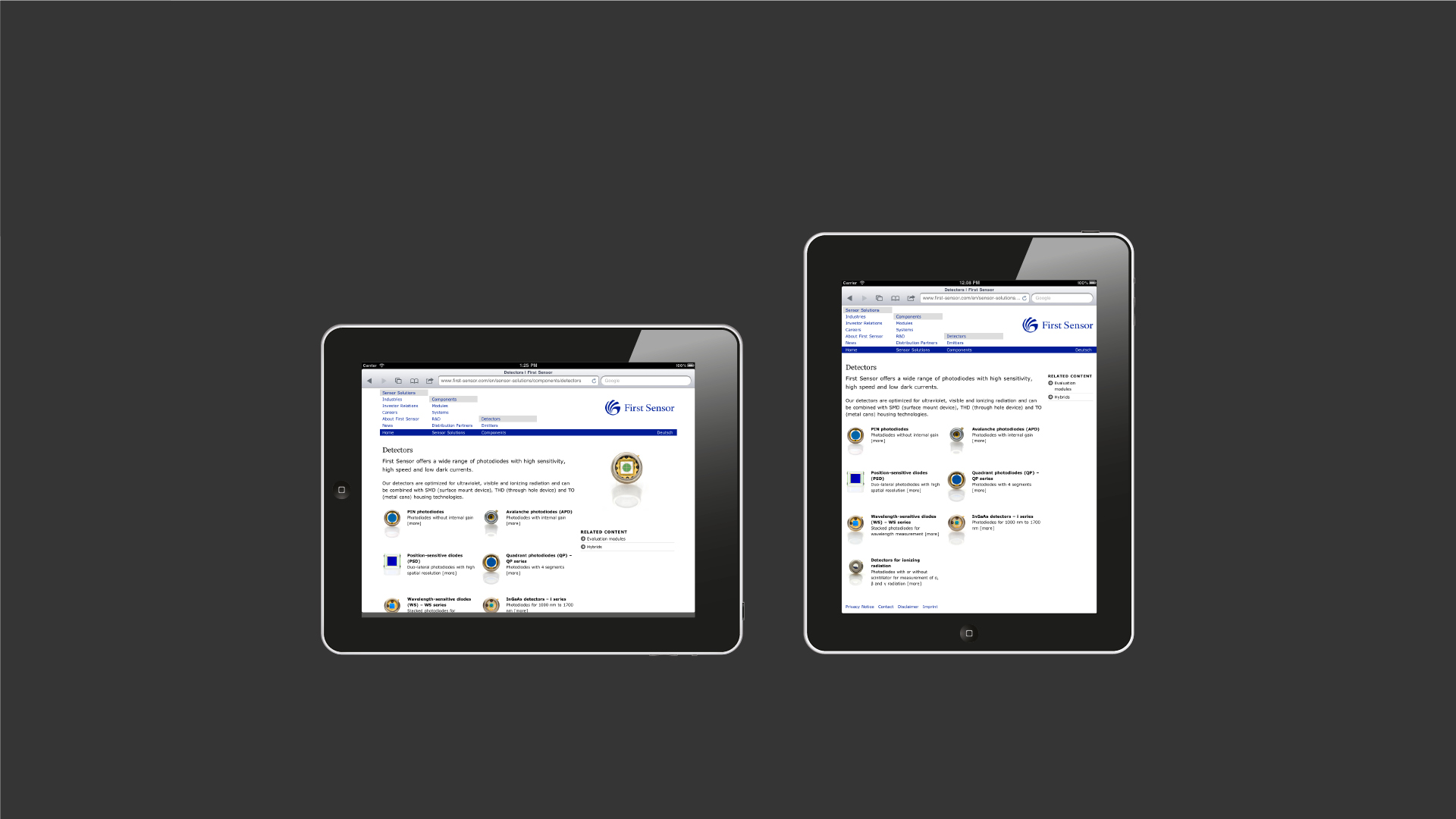
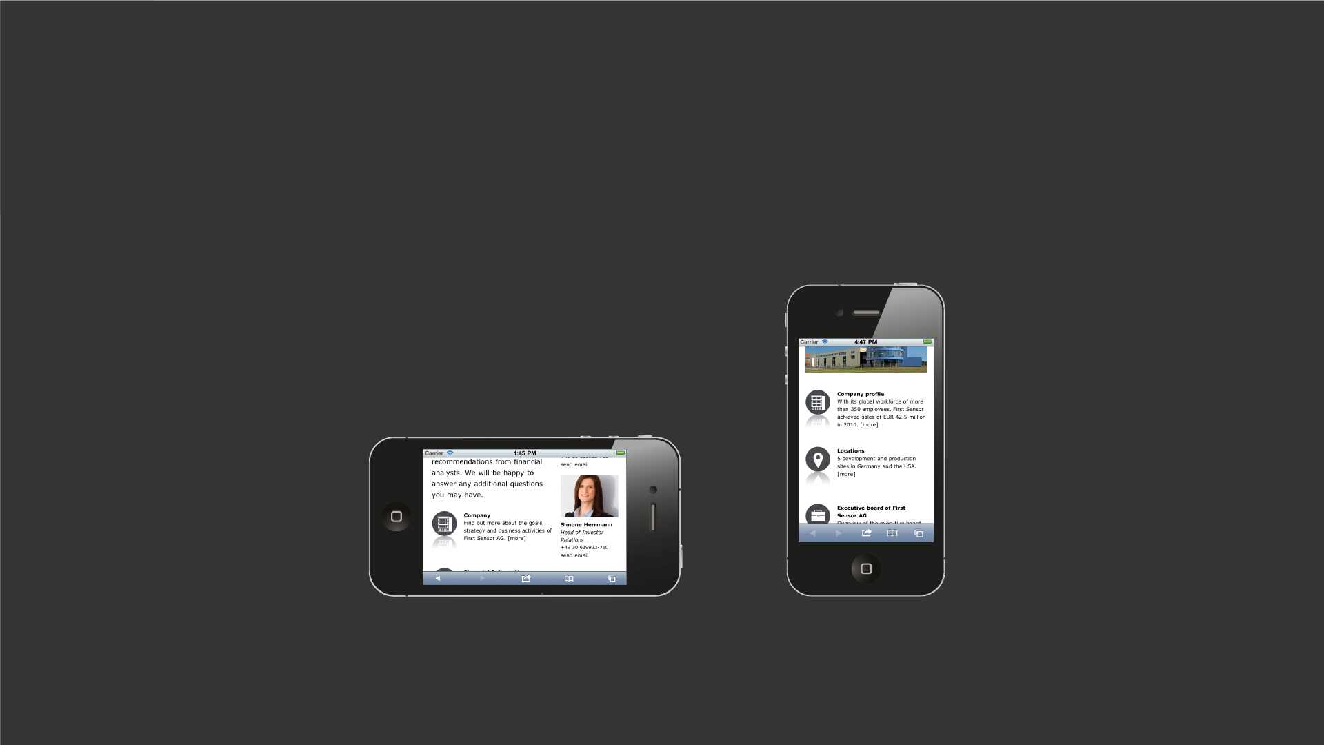
The First Sensor website presents everything you could possibly want to know about this German technology firm. From products to complete sensor solutions and from investor relations to career opportunities the site has been designed to communicate a divers range of content types in a ‘responsive design’.
Depending on the screen resolution, the site scales seamlessly to present the contents in a layout that is optimised for each visiting device. Unlike many sites that use multiple design themes for desktop computers, tablets and smartphones, the First Sensor site uses a single chameleon-like design that automatically adapts to its surroundings.
Client information
Related projects