Foster + Partners Identity
Description

Foster + Partners Identity

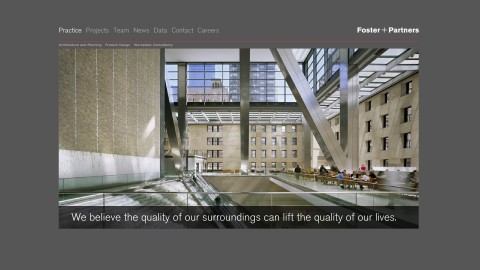
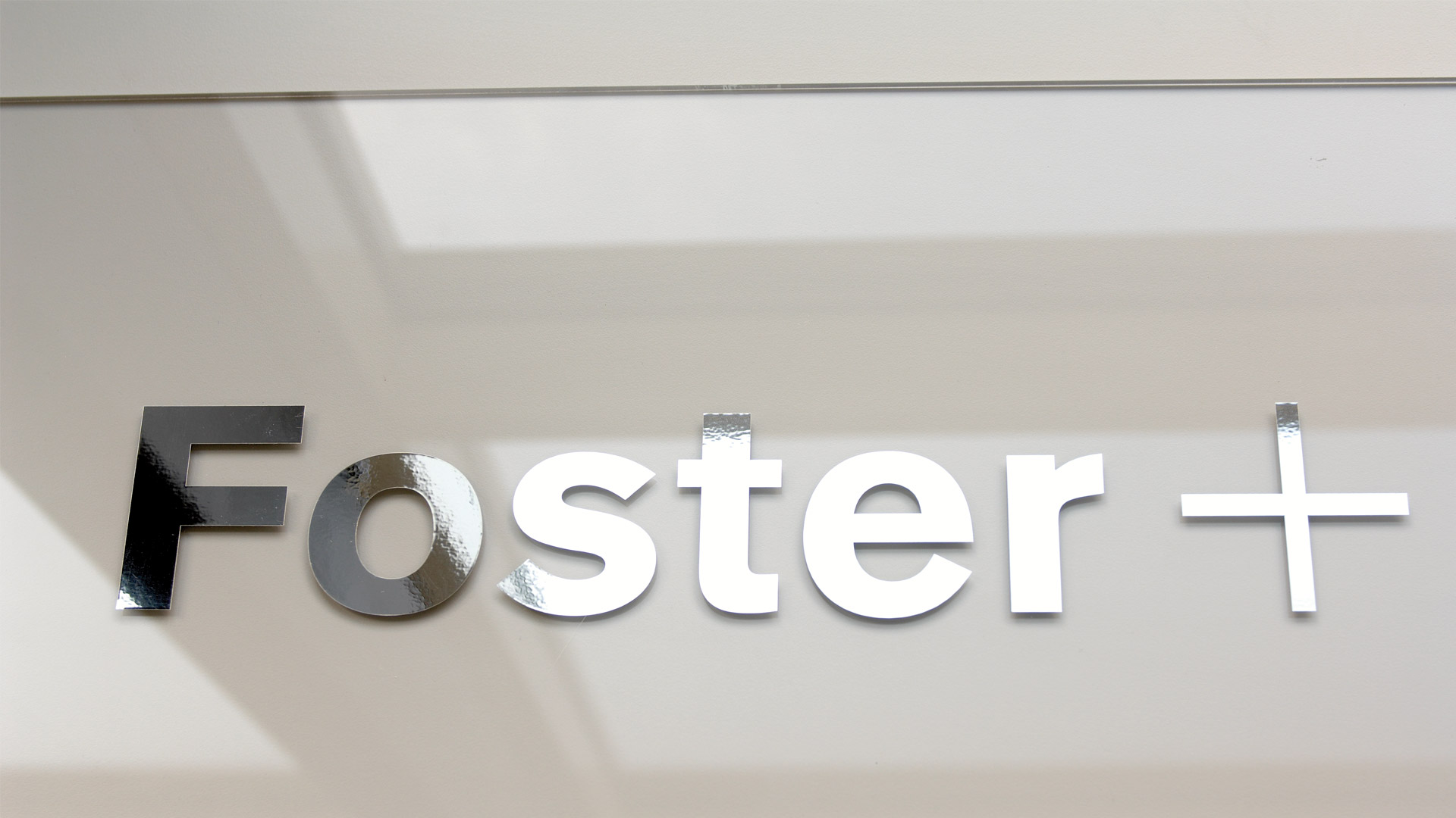
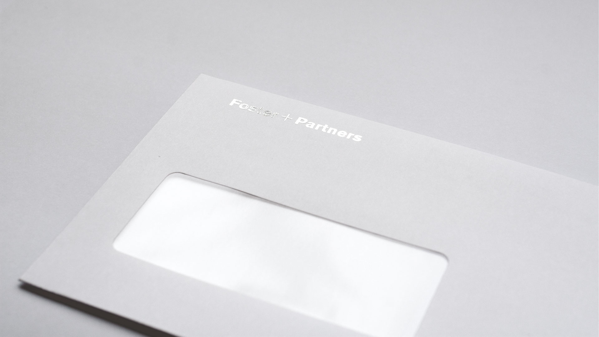
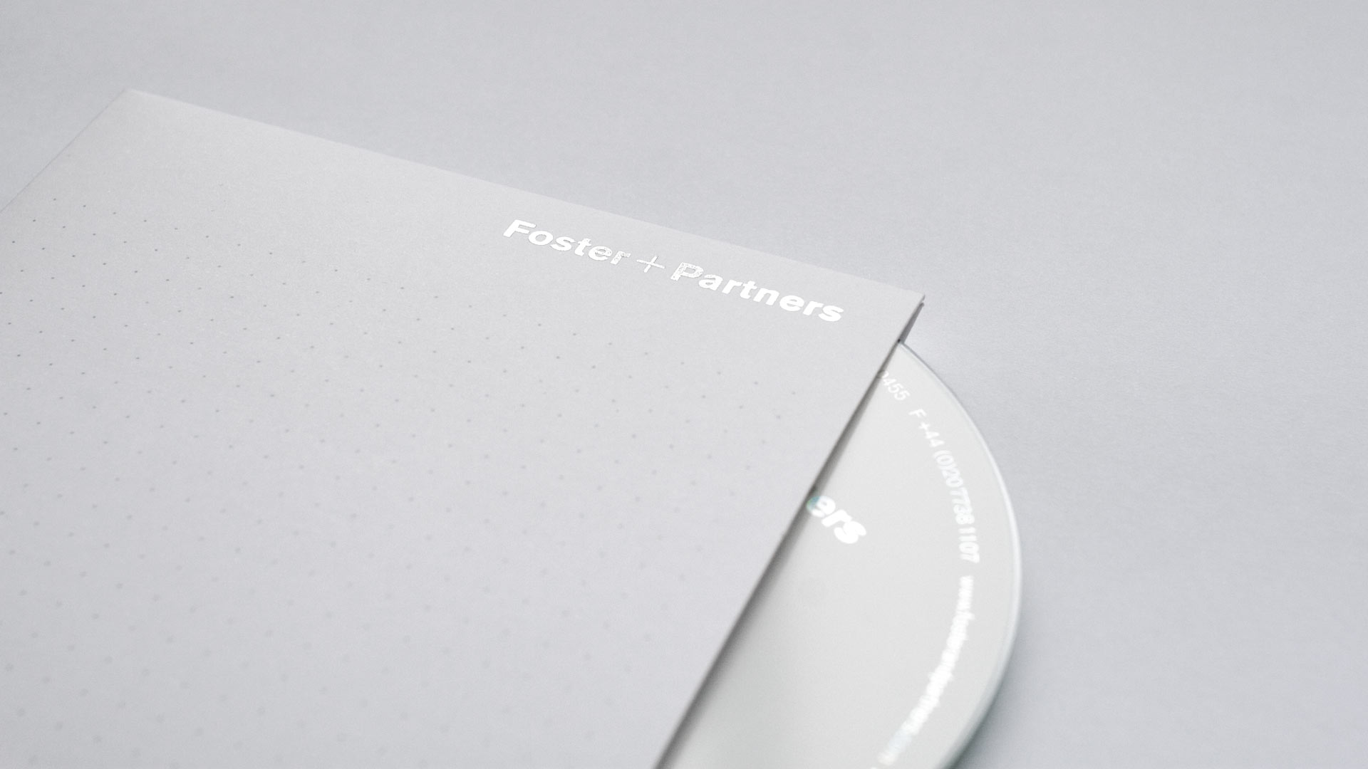
For many years the Foster + Partners identity had been based on Otl Aichers Rotis typeface. Much like Fosters architecture, the identity had inspired many young architects who were beginning to 'outfoster' the practice by using the same typeface, colours and disciplined approach to typography.

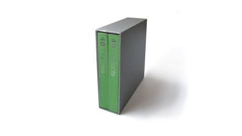
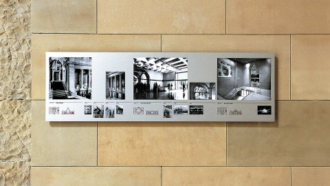
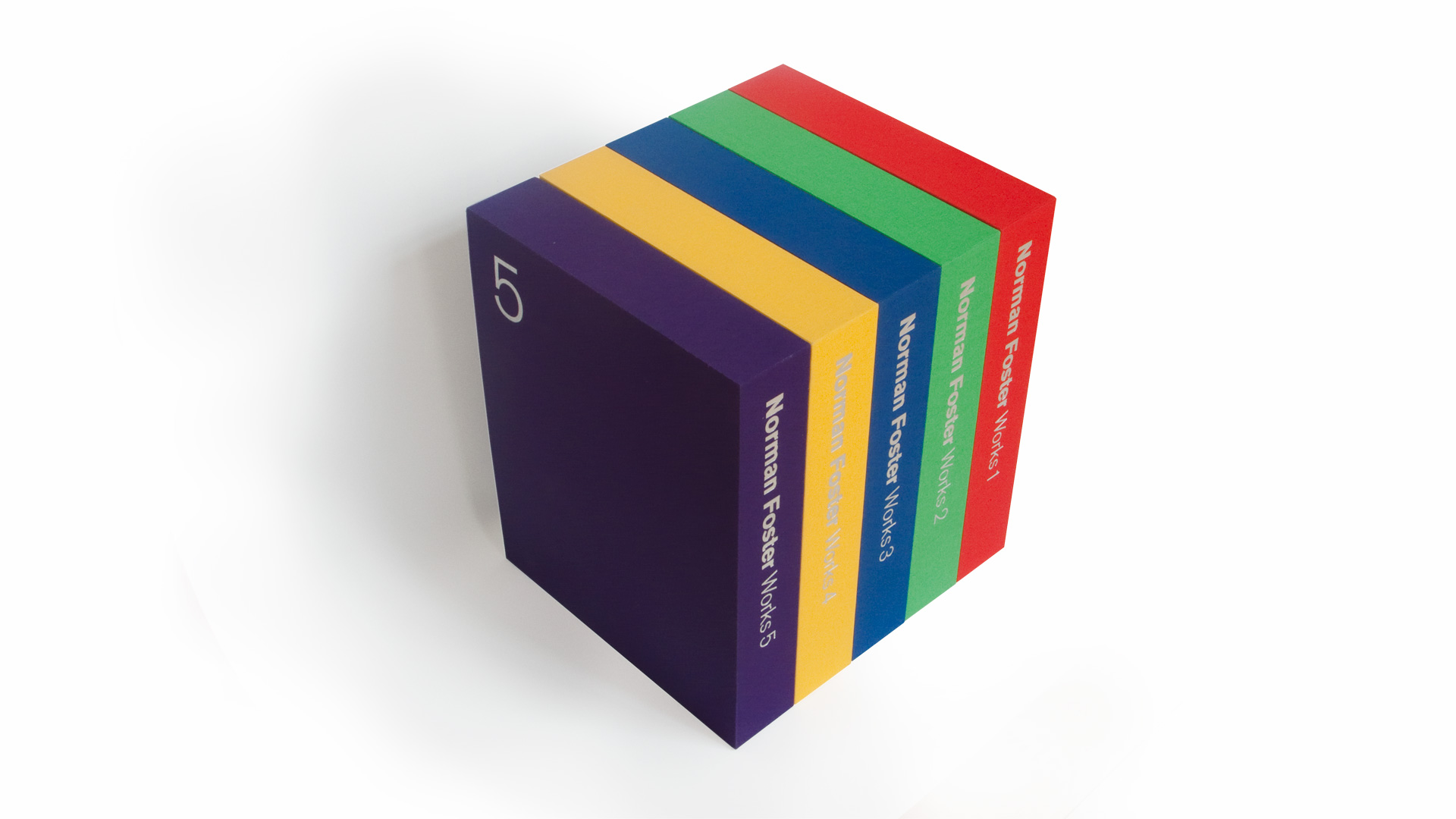
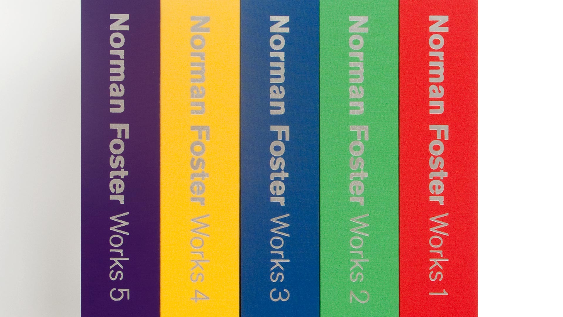
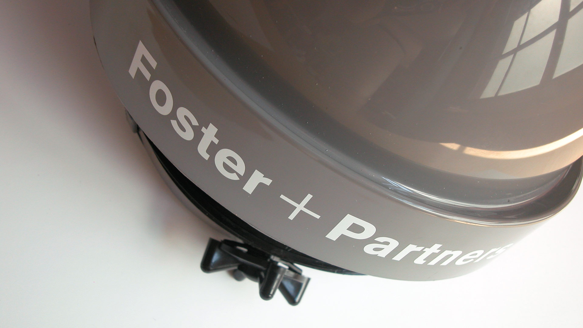
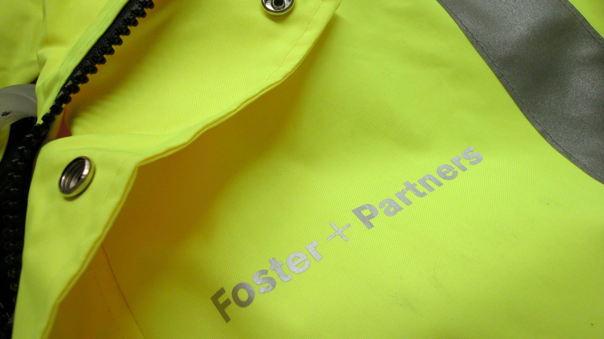
A thorough redesign re-established Foster + Partners as the rightful leaders in their field and was implemented across all areas of the business including website and intranet, reports and publications, signage and protective clothing as well as office supplies and stationery.

Client information

Foster + Partners

Founded in 1967 as Foster Associates and now known as Foster + Partners, for over four decades the studio has grown to become one of the largest and most respected in the world. Since its inception, the practice has received more than 400 awards and citations for excellence and has won more than 70 international and national competitions.

Foster + Partners has a long a history of producing landmark buildings including the Hongkong and Shanghai Bank, Swiss Re in the City of London, the Millennium Bridge, the New German Parliament at the Reichstag, the Great Court at the British Museum and Beijing Airport.

Thomas Manss & Company has collaborated with Foster + Partners on a number of projects ranging from identity and exhibition designs to creating a variety of architectural publications.