
The Museum of English Rural Life Identity
Description
The Museum of English Rural Life Identity
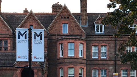
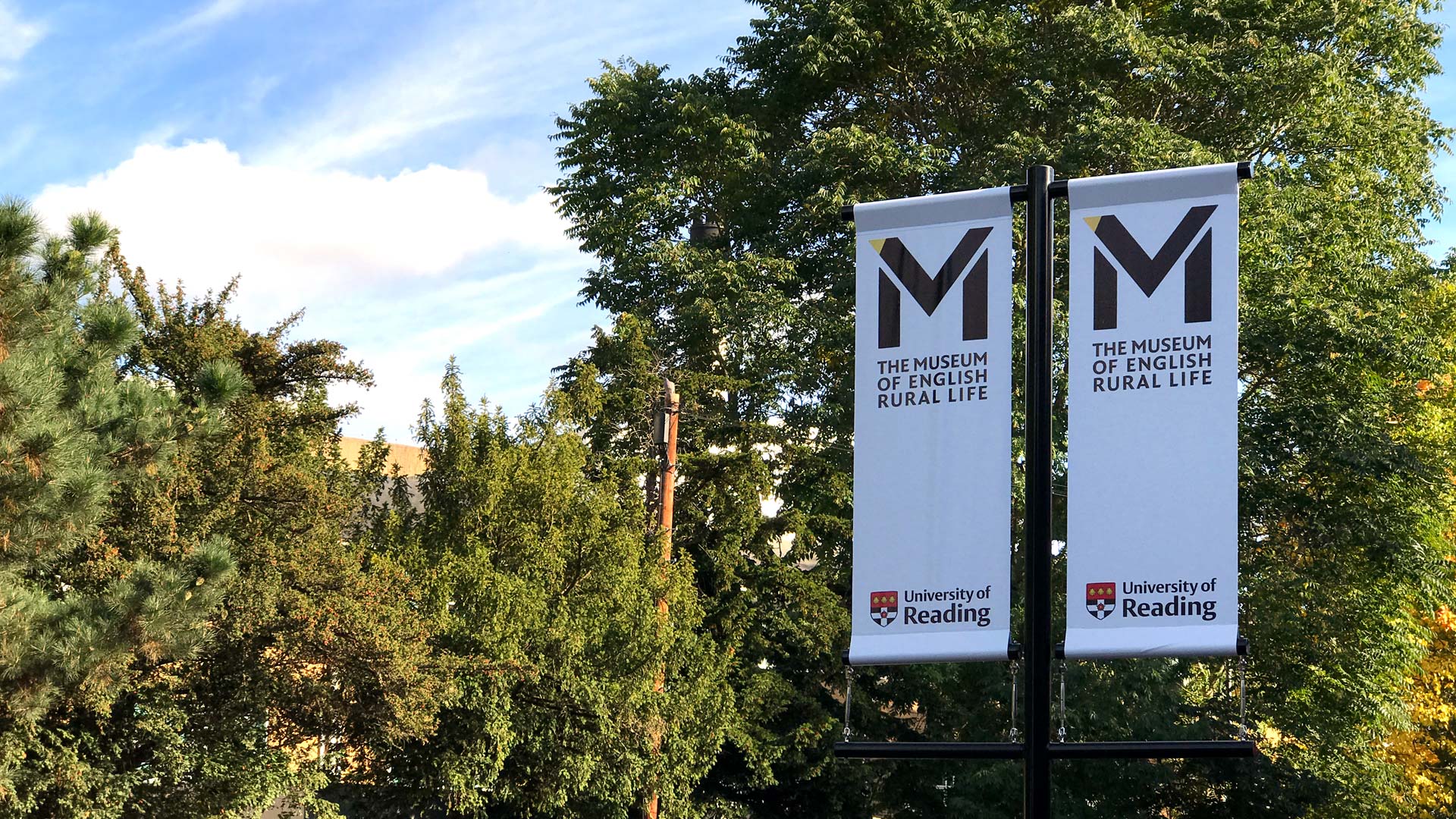
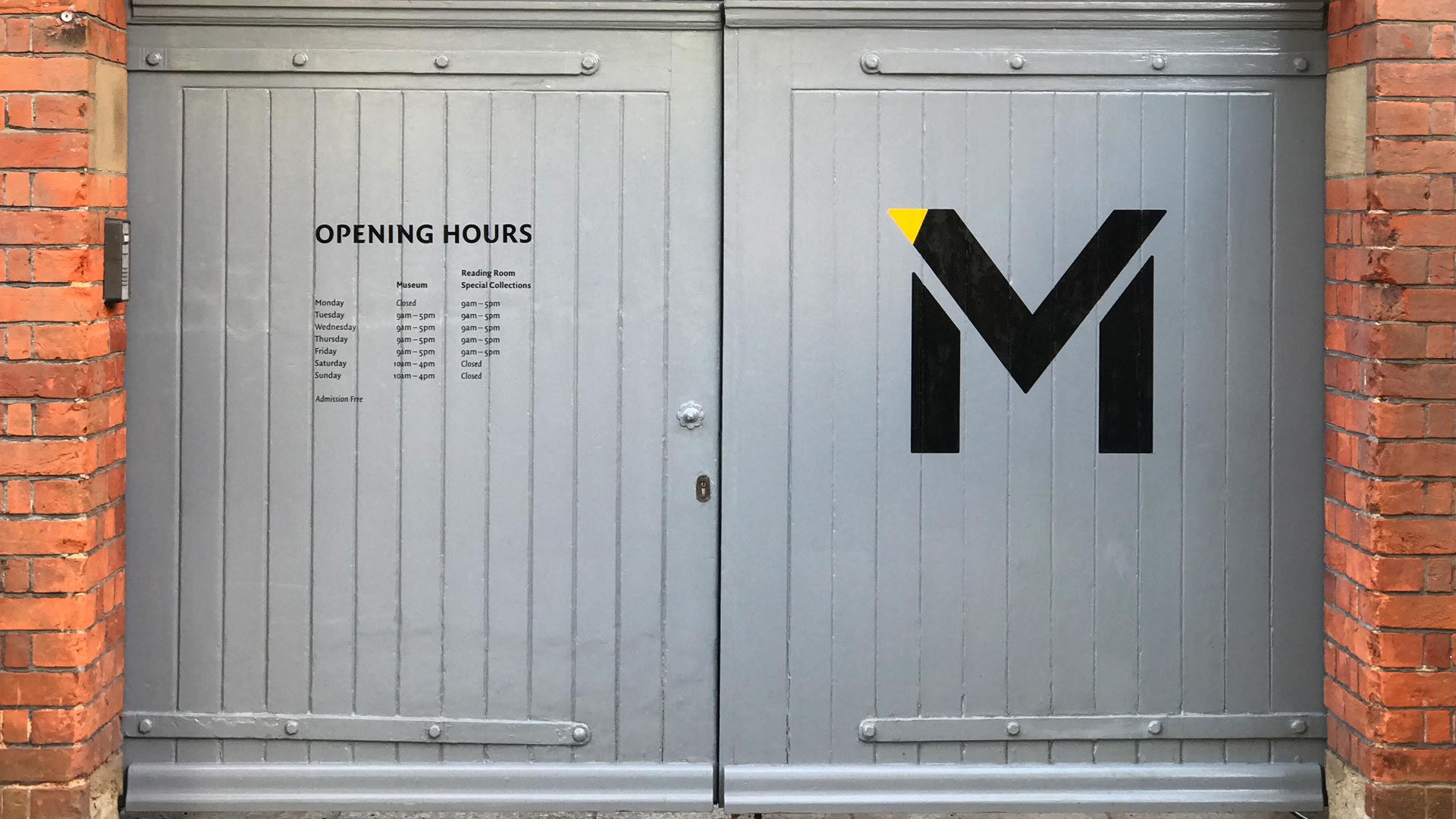
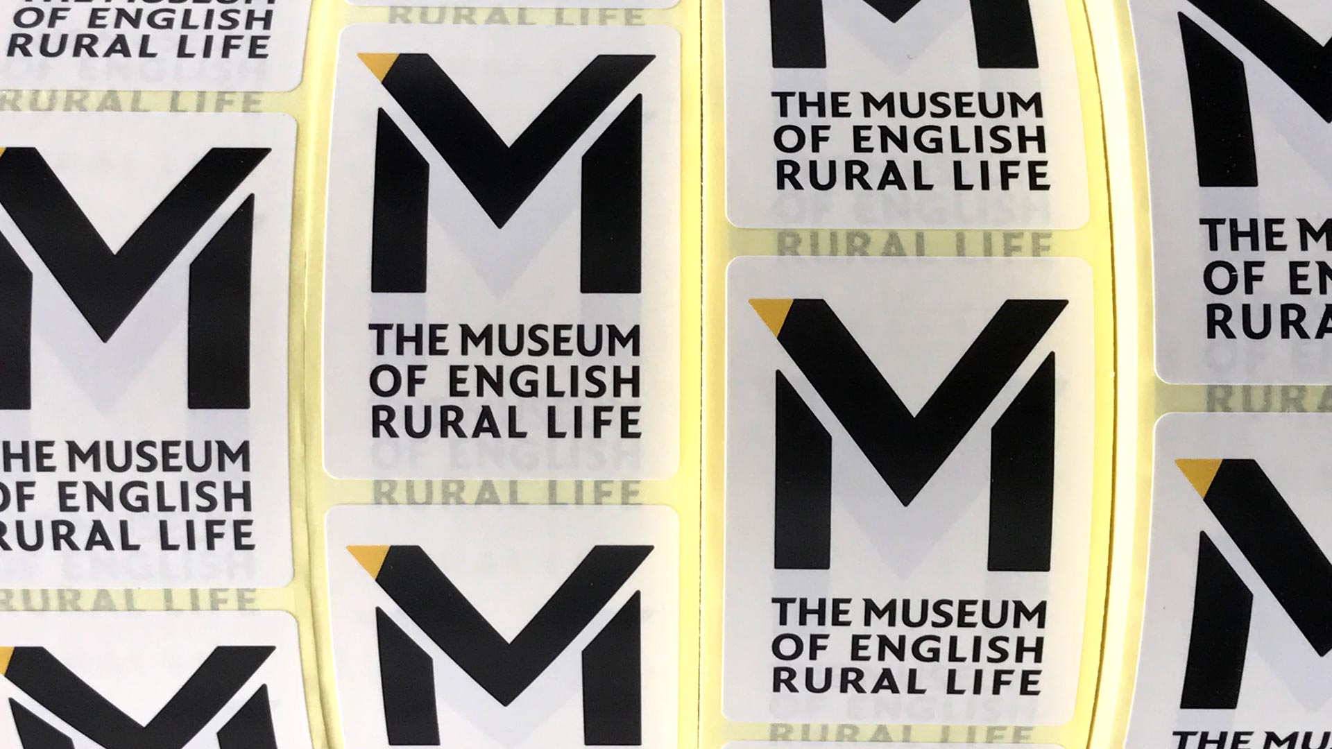
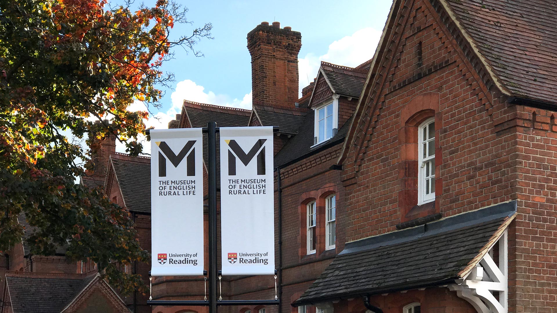
The starting point for the visual identity of The Museum of English Rural Life was the fact that staff and the public alike frequently refer to the Museum by its acronym: M-E-R-L. The discovery that ‘merl’ is also another name for the common European blackbird not only immediately suggested a character that has an affinity to the English countryside, it also makes the Museum’s name more accessible as well as more memorable.
The merl’s iconic black plumage, bright yellow bill and upturned tail lends the Museum’s logotype its instantly recognisable character and is being used to identify the Museum of English Rural Life online, in print and around the building.
Client information
Related projects