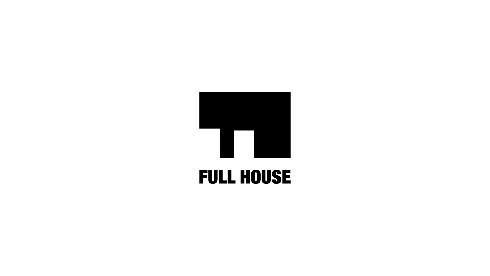
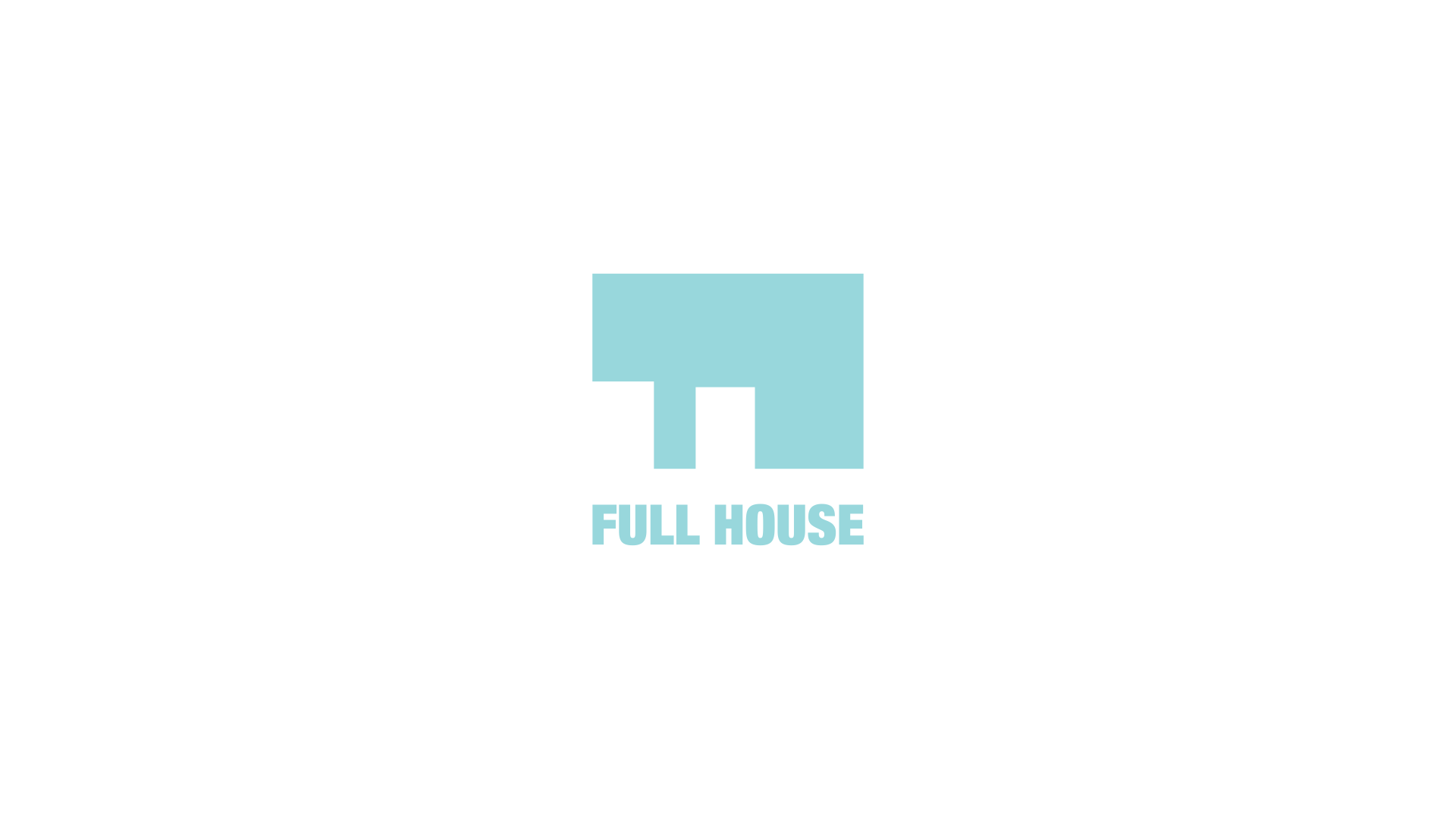
Full House Logotype
Description
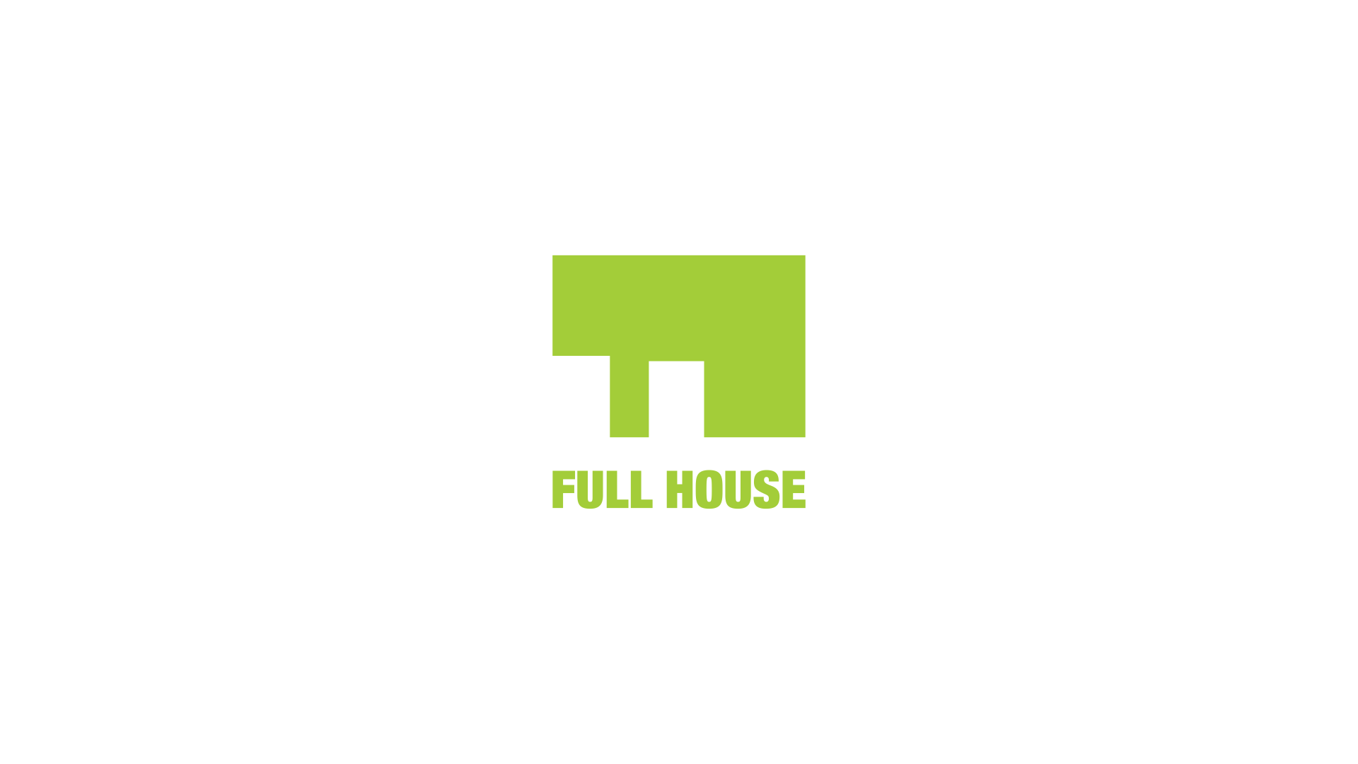
Full House Logotype
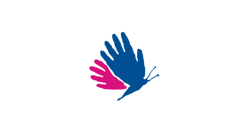
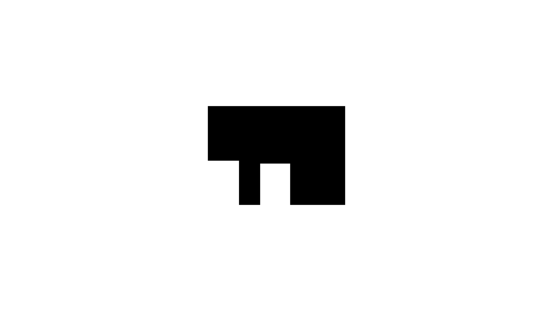
Together with the Full House name, the logotype of this project for young disabled adults tricks the brain into seeing just that – a modernist house; when all it really is, is a rotated capital letter F reversed out of a colour square. The resulting simple yet bold shape can be used in any colour thus introducing a playful element into the project's identity.
Client information
Related projects