• Thomas Manss & Company
    • Home
    • Kunden
      • A-Z
      • Architektur
      • Kunst & Kultur
      • Beratungsunternehmen
      • Design & Living
      • Öffentlicher Dienst
      • Verlage
      • Dienstleistungen
      • Technologie
      • Transport
      • Well-being
    • Projekte
      • Erscheinungsbilder
        • Alle
        • Bowers & Wilkins
        • Bowers & Wilkins New Media
        • FH Brandenburg
        • Foster + Partners
        • Hotel Arts Barcelona
        • Marchese Antinori
        • Neri
        • Oberhavel Verkehrsgesellschaft
        • Oyuna
        • Palazzo Avino
        • Photographic Portrait Prize
        • The Merl
        • Vivité
      • Zeichen & Logos
        • Alle
        • AIMA
        • Beuse
        • Depken & Partner
        • Giardini del Fuenti
        • Hamburg School of Ideas
        • Lill
        • Meoclinic
        • Oxford PV
        • Oyuna Cashmere
        • Pat Prudente
        • The Merl
        • Val Taylor
        • VCC Perfect Pictures
      • Websites
        • Alle
        • Adorno Magazin
        • Chris Dyson
        • Datatrain Cockpit
        • EDSA
        • Fedrigoni Group
        • Fedrigoni Paper Selector
        • Foster + Partners
        • Mindseye
        • Oxford PV
        • Palazzo Avino
        • PRSArchitects
        • Studio Fuksas
      • Broschüren & Jahresberichte
        • Alle
        • Arjo Creative Papers
        • ATeNe Wörterbuch
        • B&W Serie 700
        • Bowers & Wilkins 800 D3
        • Der Wert von gutem Design
        • Fedrigoni Geschäftsbericht 2016
        • Fedrigoni Hotel Buch
        • Fedrigoni Imaginative Whites
        • Fedrigoni Metallicpapiere
        • Fedrigoni Report 125
        • FNT Kundenmagazin
        • National Portrait Gallery Führer
        • Vitsœ Installation
      • Bücher
        • Alle
        • 21st Century Portraits
        • A Bouquet of Colours
        • Dymaxion-Auto
        • Eduardo Chillida
        • Foster 40, Prestel
        • Foster Works, Prestel
        • Gerhard Richter Portraits
        • Havana – Autos & Architecture
        • Hodder + Partners
        • McLaren - The Art of Racing
        • Moving
        • O Carnaval de Pixinguinha
        • Patrick Heide 10 Jahre
        • Photographic Portrait Prize
        • Zaha Hadid, Thames and Hudson
      • Magazine
        • Alle
        • Art Quarterly
        • Bound by Sound
        • British Museum
        • C Photo
        • C Photo Venedig
        • Infocus
        • JMP Journal
        • Martin Parr Journal
        • Neri Magazin
        • Salon 2007
        • Salon 2010
        • Salon 2011
        • Salon 2012
        • Vitsœ Voice
      • Kampagnen & Plakate
        • Alle
        • Arjo Wiggins Yearling
        • Bachchor Gütersloh
        • Bowers & Wilkins Zeppelin
        • CIM Database 10
        • Creative & Media Diploma
        • Face of Fashion
        • Fedrigoni Century
        • Gerhard Richter, Portraits
        • Gilò
        • Hotel Arts Weihnachten
        • Maserati Trofeo Series
        • Norman Foster Film
        • Photographic Portrait Prize 2012
        • X Stories
      • Ausstellungen & Leitsysteme
        • Alle
        • Bowers & Wilkins 50. Jahrestagung
        • Cannon Bridge House
        • Deloitte
        • Fedrigoni Luxepack 2019
        • London Remembrance Gallery
        • Reichstag Museum of Spaces
        • Seven Notes Tour
        • Somerset House
        • Tate Modern
        • The Crime Museum Uncovered
        • The Merl
        • Top Award 2017
        • Top Award 2019
        • Urban Age 2013 Rio
        • Vitsœ Leamington
    • Veröffentlichungen
      • Alle
      • 20 Jahre
      • Alphabet Booklet
      • Business Guide
      • Die Hauptstädte Europas
      • Characters and other types
      • Stille Post 2.0
      • Farben sprechen alle Sprachen
      • Design und Harmonie
      • Design: Thomas Manss & Company
      • Designer & Geschichtenerzähler
      • Schönste Momente
      • Die vergessenen Erfindungen
      • HomeSapiens Magazin
      • Berlin London
      • Olympische Kuriositäten
      • Ordnung & Eccentricity
      • Wortpaare
      • Die Welt der Wirtschaft
      • Denkfallen
      • Die Unübersetzbaren
    • Über uns
      • Was wir tun
      • Team
        • Alle
        • Cameron Armstrong
        • Adele Bacci
        • Cristina Giménez
        • Andrew Hinds
        • Masafumi Inaba
        • Thomas Manss
        • Matt Watt
        • Matthias Berg
      • Gedanken zum Design
      • Meinungen
    • Kontakt
    • Impressum & Datenschutzerklärung
Tools
Follow us
  • Facebook
  • Twitter
  • LinkedIn
deSwitch language
  • English
  • Italiano
  • Español
Search

In unseren Projekten fokussieren wir uns darauf, eine gehaltvolle Geschichte zu erzählen, anstatt lediglich hübsche Layouts zu gestalten. Dieser Ansatz hat Kritikerlob von Kunden, Journalisten und Designkritikern gleichermaßen hervorgerufen.

Karneval
Top 10
Brechung
Farbe
Ausbildung
Spaß
Humor
Eindruck
Integrität
Meisterhaft
Medien
Erzähler
Ordnung
Organisiert
Qualität
Auffälligkeit
Reputation
Eindeutigkeit
Überraschung

Karneval

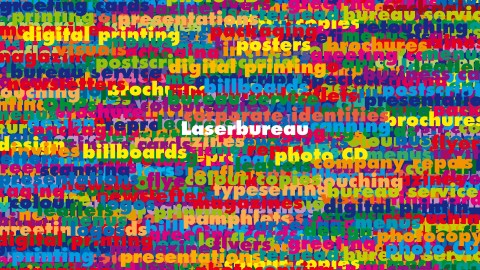
Das Ergebnis ist ein Reigen aus Wörtern und Farben, die um die Aufmerksamkeit des Lesers buhlen, eine Art Karneval in einer Farbenfabrik.
Steve Shipside, Journalist

Read more …

True Colours

How do you create an effective identity when the company’s business keeps changing to stay in line with new technology? Steve Shipside examines Thomas Manss & Company’s work for Laserbureau.

“You can have all the colours you want, but don’t come back with any cool designer nonsense.” No, not Henry Ford the morning after, but Joe Brim, owner of Laserbureau, briefing a designer on the creation of an new corporate identity. Laserbureau is a technology production company servicing ad agencies, design companies and the like. The unlimited colour promised by Brim comes courtesy of Laserbureau’s in-house technology. However, if the technology removed the colour barrier, it posed a problem of its own. Where once Laserbureau was content to run out bromides, it has since embraced new technology with a passion. Encompassing all of that presented quite a chalenge to the designer, Thomas Manss. “The client said ‘We need a new logo to present what we’re doing,’ so I said ‘what are you doing?’, He replied ‘oh, that changes every four weeks.’ So a static logo would have been a problem.”

Manss doesn’t look as if he was particularly daunted by this. He first came to the attention of Laserbureau as a customer. He clearly made an imression because a year and a half later they called him to ask if he could help with their new image. He certainly agreed that they needed one. The solution that Manss hit on was to take Laserbureau owner Joe Brim at his word, and give a feeling for the breadth of the services offered by the company. Since those services could be changed at any moment the design was intended to make it easy to adapt. The result is a riot of words and colours jostling with each other for attention, like a carnival in a paint factory. “Yes, it seemed safely outrageous… and in the end such an enthusiastic business card is perfect for Joe.” Colours were: “whatever you can do in the four colour process – there is no house colour.” Manss acknowledges that the Latin American flavour of the result may owe a little to work he did for the Hotel Arts Barcenlona, which was equally vivid. As for fonts, Futura was selected, but as Manss explains, the brashness of the design left him with little choice in that department. “I tried a few other fonts but what we needed was maximum ink coverage and you need really bold fonts for these pattern – you can’t use an nice Swift face. Futura seems the best choice for such a fat face.”

The design also had to work large or small – it’s now appeared on business cards, folders, letterheads, promotional watches, a billboard, and, most dramatically of all, on a 30 meter long banner running right across the shop fornt in London’s Crawford Street. The flexibility that lets a logo span the gamut from business cards to shop fronts is the key to this particular client’s identity. According to Manss, however, the identity probably has further evolution ahead of it if it’s to keep up. “If they have a new service the can place it in on top.”

Steve Shipside
Graphics International, London, UK

Laserbureau Erscheinungsbild
Project

Laserbureau Erscheinungsbild

Auf den ersten Blick sieht das Erscheinungsbild wie eine Ansammlung unzusammenhängender Wörter aus. Beim genaueren Betrachten entdeckt man jedoch die vom Unternehmen angebotenen Dienstleistungen. Je nach Anwendung werden wichtige...
VCC Perfect Pictures Zeichen
Project

VCC Perfect Pictures Zeichen

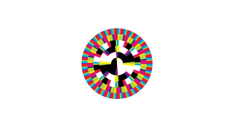
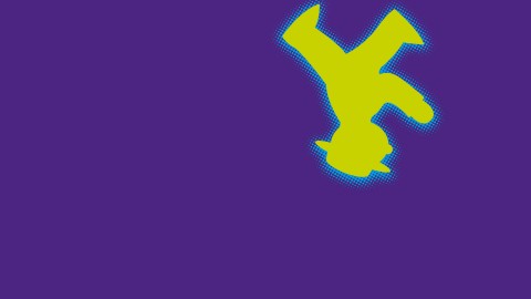
Das Zeichen dieses Post-Production Hauses ist inspiriert von einem optischen Effekt, der im 19. Jahrhundert entdeckt worden ist: die Rotation eines Schwarzweißbildes lässt Farben entstehen. Hier geschieht das Gegenteil: im Ruhezustand –...
UK Centre for Carnival Arts Symbol
Project

UK Centre for Carnival Arts Symbol

Das Zeichen für das UK Centre of Carnival Arts ist häufig als ein aus der Vogelperspektive betrachteter karibischer Tänzer, tanzend in seinen farbenfrohen Kostümen, interpretiert worden. Es ist aber auch schon mit einem Aufruhr in einer...

Top 10

In der wöchentlichen Kolumne „The Top Brass“ kürte „The Independent on Sunday“ Thomas Manss zu einem der zehn besten Grafikdesigner in Großbritannien.
The Independent

Brechung

Thomas Manss & Companys Design folgt keinen flüchtigen Moden, sondern vertraut auf kleinen Brechungen, die für bleiben Eindruck sorgen.
Deborah Richardson, Objective Communications

Read more …

Being a specialist is all very well, but it won’t win you the decathlon, reckons Deborah Richardson

When asked why he became a graphic designer, Thomas Manss is inclined to quip: “I joined the shorter queue”. He qualifies this with an explanation: despite every intention of following in his parents’ footsteps and becoming an architect, seven years of study and 20-30 more years before a major project would be built had limited appeal. By a quick process of elimination – helped by a shorter line for graphic design at university registration – he found an alternative which would satisfy his inclination to solve intellectual problems visually.

The anecdote reveals a great deal: a ready wit, intuitiveness, an aptitude for paring down a problem to its essentials, quick lateral thinking and an ability to come up with a well-judged solution. In fact, it sums up the work.

If Thomas Manss & Company’s work shows a certain single-mindedness, it is no contradiction that it is exemplary in its diversity. If you liken an identity programme to a decathlon and the designer to a decathlete, you begin to get the idea. It’s no good if you can sprint well but don’t pass the muster in the shot put; likewise you won’t win any medals if your logos are masterful but the web application is weak. As a body of work, the identities, symbols and marks, promotional collateral and annual reports, exhibitions and screen designs in this book demonstrate the decathlete’s skill. They also have that extra magic that makes the performance memorable… and the client the real winner.

Deborah Richardson

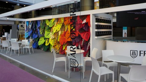
Fachhochschule Brandenburg Erscheinungsbild
Project

Fachhochschule Brandenburg Erscheinungsbild

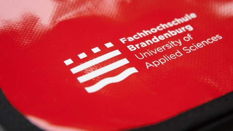
Als die Fachhochschule Brandenburg Thomas Manss & Company mit der Überarbeitung des Erscheinungsbildes beauftragte, zeigten die ersten Untersuchungen, dass die idyllische Umgebung mit ihren unzähligen Wasserwegen und...
Neri Erscheinungsbild
Project

Neri Erscheinungsbild

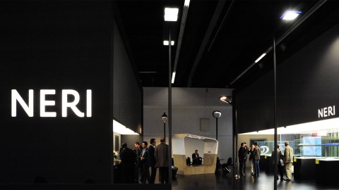
Ein 50-jähriges Jubiläum ist ein wichtiger Meilenstein für jedes Unternehmen. Für den italienische Hersteller von Außenleuchten und Stadtmobiliar Neri bedeutete das weniger ein einmal erreichtes Ziel als ein Aufbruch zu neuen Ufern. Das...
Oyuna Erscheinungsbild
Project

Oyuna Erscheinungsbild

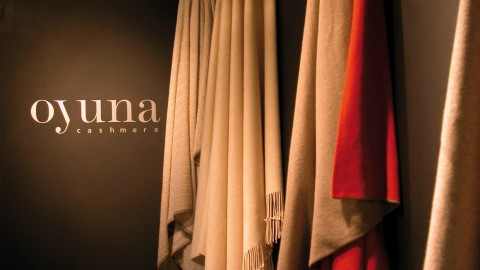
Oyuna hat sich mit Wohnaccessoires und Damenkollektionen einen Namen unter den Luxus-Modemarken gemacht. Dies war das erklärte Ziel, als Thomas Manss & Company seinerzeit mit der Entwicklung eines neuen Erscheinungsbildes beauftragte...

Farbe

Ein deutscher Designer wohlbekannt für seinen Farbsinn.
Aveleine Byrd, Journalist
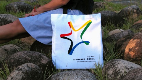
Deutschland + Brasilien 2013–2014 Erscheinungsbild
Project

Deutschland + Brasilien 2013–2014 Erscheinungsbild

Deutschland und Brasilien 2013-2014 ist ein Projekt des Deutschen Auswärtigen Amtes zur Förderung der Beziehungen beider Länder. In allen größeren Städten Brasiliens werden von der Deutschen Forschungsgemeinschaft und dem Deutschen...
Zal Telecomunicazioni Corporate Identity
Project

Zal Telecomunicazioni Corporate Identity

Das Versprechen des Telekommunikations-Unternehmens Zal kokettiert mit der allgemein akzeptierten Wahrnehmung, dass diese Branche vor allem für ihren miserablen Service bekannt ist – und geht einen anderen Weg. „Die neue Farbe der...
Benjamin Foundation Zeichen
Project

Benjamin Foundation Zeichen

Die Benjamin Foundation verhält sich eher wie eine Familie, nicht wie eine Wohltätigkeitsorganisation. Sie unterstützt bedürftige Menschen, indem persönliche Beziehungen mit Ziel aufgebaut werden, über den Dialog Verständnis zu entwickeln...

Ausbildung

Thomas Manss & Company ist kein Designbüro, es ist eine Meisterklasse für aufstrebende Grafikdesigner.
David Jenkins, Writer and Critic
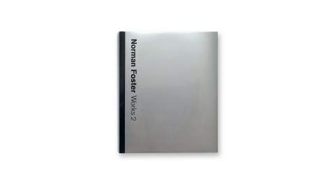
Foster Works, Prestel
Project

Foster Works, Prestel

Foster Works ist eine sechsbändige Ausgabe des kompletten Foster Œuvres von den frühen Team 4 Anfängen bis zu den jüngsten Projekten. Foster Works folgt der Tradition der in den 80er Jahren von Otl Aicher gestalteten Foster Volumes und ist...
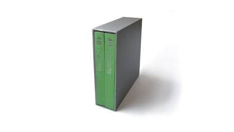
Foster 40, Prestel
Project

Foster 40, Prestel

2007 feierte Norman Foster das vierzigjährige Bestehen als unabhängiges Architekturbüro. Das ausgezeichnete Buch ist eine Zusammenschau von vierzig der wichtigsten Projekte Norman Fosters, zusammen mit vierzig Themen, die sich als...
Foster + Partners Reichstag Museum of Spaces
Project

Foster + Partners Reichstag Museum of Spaces

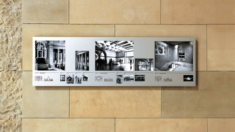
Die permanente Ausstellung „Museum of Spaces“ im Berliner Reichstag wurde in Zusammenarbeit mit dem Architektenbüro Foster and Partners realisiert. Sie ist der Entwicklung dieses Bauwerkes in den letzten einhundert Jahren gewidmet...
Foster + Partners Erscheinungsbild
Project

Foster + Partners Erscheinungsbild

Das Erscheinungsbild von Foster + Partners basierte viele Jahre auf der Schrift Rotis von Otl Aicher. Viele junge Architekten haben sich durch dieses Erscheinungsbild – wie auch durch Fosters Architektur – dazu inspirieren lassen, dieselbe...

Spaß

Seinen Spaß ernst zu nehmen ist das Geheimnis von Thomas Manss’ Erfolg.
Conway Lloyd Morgan, Autor und Designkritiker

Read more …

“Everything you could have nicked from that hotel, we designed,” Thomas Manss explains with a grin. The hotel is in Barcelona, with architecture by Bruce Graham and Frank Gehry, now managed by the Ritz Carlton Group. “The American developer sold the hotel to the Ritz ready to roll, with two years supply of everything – sewing kits, placeholders, menus, and so on – and we designed them all.” But then Manss is no stranger to large-scale projects. When he qualified from design school in Berlin, he went to work for the Berlin office of Sedley Place: “My first client was the German Post Office, the largest employer in Europe, which was after a new identity. The second was Volkswagen. And my friends were starting out with fun stuff – posters for art galleries, letterheads for their chums.”

In 1989 Manss moved to London, to work with Alan Fletcher at Pentagram (“I told Alan that I’d do anything – absolutely anything – except design in Neue Helvetica again”) and four years later opened his own office. An invitation back to Berlin as a visiting professor led to comissions in Germany, and the opening of a Berlin office in 1996. “We have had a lot of foreigners working here, designers from Spain and Holland, even an Zimbabwean with an Italian passport, once. I like the changes of perspective we get from contact with these different cultures – I see myself as a European, not as either British or German – no Perpetua small caps, but not everything at right angles, either.”

As well as travelling between London and Berlin, as Manss puts it, the company oscillates between corporate work and fun projects. Manss designed the catalogue for the Stirling Wilford exhibition at the RIBA in 1996, and again for Michael Wilford exhibition in Bilbao this year. He has also worked for Michael Hopkins and Partners, and for Nicholas Grimshaw. As well as designing several books for Phaidon, including Hugh Pearman’s recent “Contemporary European Architecture”, Manss has done a number of promotional pieces for Arjo Wiggins Fine Papers, and is currently redesigning the National Art Collection Fund magazine and Annual Report. “But we also do a lot of work for the Institut of Directors,” he points out, “and you can’t get more serious than that.”

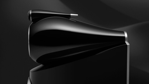
Often one corporate project leads to another: “Because of our core expertise in creating corporate identities,” he explains, “we are often seen as having a broader understanding of the company than the company itself, so we get asked to take on further tasks, such as trade fair stands and sponsored exhibitions. We recently did an identity for the Oberhavel Verkehrsgesellschaft bus company, which in turn led to stationery, then merchandising and sevice cards, and even uniforms.” With B&W, Britain’s most important loudspeaker manufacturer, it was a case of working from the bottom up. Manss was asked to create the branding for Solid, an affordable lifestyle system. His most recent work for them is the brochure for the new Nautilus 800 range: “They said it was the Aston Martin in loudspeaker design, so I modelled the brochure on a car.” Seductive photographs of details (headlamp or horn?) and expanded technical drawings, are presented on heavy A3 paper.

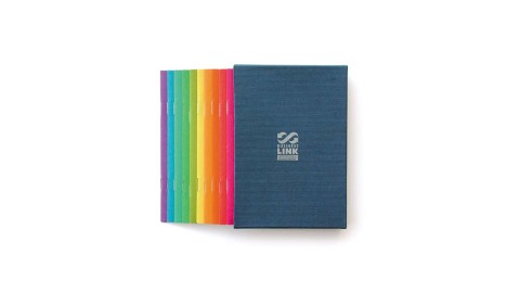
“As I see it, the designer has two tasks,” Manss explains, “the first is to resolve the problem the client has brought to you, and the second ist to make this solution desirable. Call the second part the X-factor or whatever: the way it works is that when you see the design, you want it.” How this operates can be seen in a recent project for Business Link Herefordshire and Worcestershire, a body which offers management advice and services to small and medium-sized businesses. Originally a nationwide Government agency, the service has now been passed to the private sector, in smaller local units. Herefordshire and Worcestershire came to Manss for a new brochure, to replace the previously shiny twentyfour pages of A4. According to Manss, “Business Link had a problem: despite its considerable local experience it was seen as a Government agency. And it had a problem selling it services. I pointed out that what its previous brochure did was to describe the product, not address the problem of Business Links customers. So what we set out to do was to define the real problems its clients had, and the relevant areas of expertise that Business Link had, and so device something to nice to throw away (the X-factor). It rapidly became a collaborative process, in which everyone contributed.” Manss hired a copywriter, Simon Hollingworth, to interview Business Link managers and existing customers, and commissioned a photographer, Nic Gaunt, to take portraits of clients and staff. The resulting material was repackaged, not a single brochure, but as a boxed set of ten twelve page booklets, ten by fifteen centimetres in size. Each booklet deals with a specific topic (such as Workplace, Export, or Manufacturing) and carries a question on the cover: “What do you need to do to maximise the impact of your product or service in the marketplace?” for example on the Marketing booklet. Inside, on the opening page, a broad brush description of the problems and opportunities involved, followed by a spread describing the various services Business Link can offer, then a spread of testimonials. The centre spread discusses the key issues in more detail, before a further spread of testimonials, a spread (reversed out) of comments from experts or specialised magazines on the topic, and a final page of contact details.

This is standard brochure fare, but the way it is organised – questions first, than answers, a way of saying “you” to the reader from the start, not “me” – make it quite different. The visual elements, especially the photography, are als key: the portraits of clients, full page facing the two testimonials pages, show them up to their necks in their work: the sport shoe manager in suit jacket and no trousers, the kitchen maker inside his own cupboard, not to mention the worm farmer. These introduce a lighter note, just as the extracts from magazine articles build in information and not just flannel. But the photographs also carry the message that if existing clients are happy to be portrayed in a fun way, then Business Link is, in a sense, worth taking seriously. The strong colours of the jackets, the punning logos for each booklet cover and the use of dark blue ink on the insides invite the reader in.

The booklets have already had an important influence in changing approaches to customers within Business Link, and are now much in demand by clients. They make the services offered relevant and accessible, through an elegant and economic graphic solution. A Design Effectiveness Award candidate, no doubt. And a fine example of Manss’ serious fun approach to design.

Conway Lloyd Morgan,
Graphics International, London, UK

Hotel Arts Barcelona Erscheinungsbild
Project

Hotel Arts Barcelona Erscheinungsbild

Hotel Arts Barcelona war der Versuch der führenden amerikanischen Hotelkette Ritz-Carlton in Europa Fuß zu fassen. Zur ursprünglichen Eröffnung des Hotels hat Thomas Manss & Company das Erscheinungsbild inklusive aller der Dinge...
Arola Restaurant
Project

Arola Restaurant

Sergi Arola hat sich in der Michelin-Stern-Szene sprichwörtlich einen Namen als Rockstar gemacht. Seine Jeans, Tattoos, Bikerstiefel und -ringe zeugen nicht nur von seiner Leidenschaft für Motorräder und Rockmusik, sondern auch von seiner...
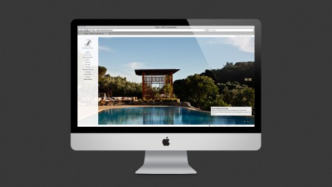
Ritz-Carlton Reserve Phulay Bay Website
Project

Ritz-Carlton Reserve Phulay Bay Website

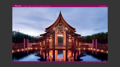
Das Ritz-Carlton Reserve bei Phulay Bay ist wohl das schönste Luxus-Refugium in der thailändischen Krabi Region. Die Aufgabe der Website ist es, der ganzen Welt dieses asiatische Paradies zu präsentieren.

Getreu dem Motte „Ein Bild sagt...
Business Link Managementführer
Project

Business Link Managementführer

Um die Akzeptanz der Unternehmensberatung bei den regionalen Unternehmen zu erhöhen, wurden statt einer Selbstdarstellung eine Reihe von Business Guides entwickelt – kleine Broschüren im Postkartenformat, die eine Vielzahl von Themen,...

Humor

Womit wir zum Kernpunkt von Humor und Witz im Design kommen: Beide sind wervolle Mittel, um eine unmittelbare Beziehung mit den Kunden aufzubauen.
Jim Davies, Autor und Designkritiker

Read more …

Graphic Wit in Britain and Germany.

Eccentric humour versus no humour – Jim Davies looks at the truth behind the stereotypes.

Southern Europeans stereotypically exhibit natural flair in everything they do. They eat and drink, fight and love, live and die with an uninhibited style and lustiness. Not surprisingly, this appetite for life spills over into their design. Move further northwards up the map of Europe, however, and national characteristics begin to shift. By the time you reach the less temperate climes of Germany and Britain, the vaunted excitable tendencies of the southern Europeans have all but disappeared. Where the Germans have a reputation for clinical efficiency and rigorous organisation, the British have one for shambolic eccentricity and charming self-deprecation. Though both nations have equally complex and subtle languages which lend themselves to sophisticated word play, German humour, some might argue, is a contradiction in terms. British humour, on the other hand, has a long and glorious reputation – self-flagellants each and every one, they simply can’t resist poking fun at themselves. So how do these entrenched national traits manifest themselves in graphic design?

Humour in design is an art, not a procedure. Like all jokes, the basis of graphic design humour is the unexpected – turning a letterform on its side, for instance, so that it becomes a pictogram of a table, or combining an image of a fish with an inappropriate word like “moo”. It will rarely make anyone roll about with mirth, but it may force a smile or engender a feeling of collusion between designer and audience. “Wit” or “playfulness” are perhaps better words to describe the level of humour in this context.

Thomas Manss is a German graphic designer with studios in London and Berlin, and a visiting lecturer in corporate identity at the Fachhochschule Potsdam. He is perfectly positioned to assess the differences in graphic wit apparent in the two countries. “First I will support the prejudice that Germans don’t have a sense of humour”, he says, nipping to the back of the studio to retrieve a pile of corporate identity manuals for Volkswagen, one of the first projects he worked on after leaving college.

To say they are thorough would be to do them an injustice. No stone, no grain of sand even, has been left unturned. There is a tome on the correct positioning of the VW logo in every conceivable size and manifestation; another volume on house colour; another on stationery; how to photograph your product; here’s one on corporate signage; yet another on overhead projections. But the manual on how to paint your factory the VW way takes the biscuit. It contains gems like “all moving parts of machines and equipment must be RAL 2001 red-orange”. Sure enough, there were very few belly laughs to be found around here.

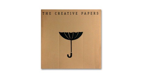
“In bad times, it’s quite good to be German”, maintains Manss. “When times are good, you want an Italian car – ok, it may not work that well, but it looks great. When there is a recession on, you have to be sensible and play safe, so you buy a German car because you know it will be reliable however bad the weather.” The analogy, he continues, also applies to graphic design; when belts are tightened, clients prefer to avoid risk by sticking to tried and tested graphic solutions. Humour is regarded as flippant and inappropriate, and a sensible, po-faced approach to design tends to prevail. Once again, it’s time to wheel on the Germans. But there’s a twist in the tale. Manss reckons he can get away with slipping more humour into his design projects simply because he is German. “Some clients think, ‘Well, if a German thinks it’s ok, then surely we can get away with it.’” A case in point is Manss’s promotional work for British paper manufacturer Arjo Wiggins Fine Papers’ Range of Creative Papers. Opening up like an old-style 12-inch record cover, the sleeve houses a series of square cards on different types of paper. Each bears a clever visual joke, which at the same time manages to highlight a particular quality of the paper.

One of the best is on the cover itself, an inverted umbrella “for catching rain in dry countries”: Printed on a ribbed paper, the area immediately underneath the brolly has been debossed, as if it were actually stopping the rain from falling beneath it. The set of images are designed to be used by salespeople as both props and promptcards; sharing these ready-made jokes with a potential client has proved a successful tool.

Which brings us to the very nub of humour or wit in graphics; it’s a valuable means of achieving an instant rapport with the audience. Having caught their attention, the more serious business of educating, informing, or selling can begin in earnest.

Jim Davies
Print, New York, US

Arjo Creative Papers
Project

Arjo Creative Papers

Creatives Papers ist eine Reihe von Phantasieobjekten, die für grenzenlose Anwendungsmöglichkeiten stehen. So soll die Aufmerksamkeit der stets viel beschäftigten Kreativen gewonnen werden, um die vielfältigen Möglichkeiten von sechs...
Arjo Wiggins Yearling Jazz & Classics Kampagne
Project

Arjo Wiggins Yearling Jazz & Classics Kampagne

Die Antwortquote der Zielgruppe der Designer für diese Directmail-Kampagne konnte sich sehen lassen. Die Kampagne hatte die Aufgabe, zwei Yearling Papers Reihen auf internationaler Ebene zu bewerben; dazu wurde ein Erscheinungsbild, ein „...
Fachhochschule Potsdam Erscheinungsbild
Project

Fachhochschule Potsdam Erscheinungsbild

Das Erscheinungsbild der Fachhochschule Potsdam basiert auf Sonderzeichen – sogenannten Emotikons – und bietet viele Verwandlungsmöglichkeiten, so dass Studenten und Professoren für ihre persönlichen Zwecke entweder eine bereits vorhandene...

Eindruck

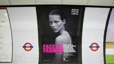
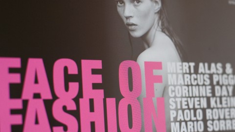
Die Juroren attestieren der Face of Fashion-Kampagne der National Portrait Gallery eine „sehr gute Umsetzung, hohe Wirkungskraft und große Auffälligkeit“. Die Jury war besonders beeindruckt von ihrer „Eleganz, dem starken Einsatz von Typographie und der fesselnden Verwendung von Fotografien“.
IMCA Awards (International Museum Communications Awards)
National Portrait Gallery, Face of Fashion Kampagne
Project

National Portrait Gallery, Face of Fashion Kampagne

Mario Sorrentis Foto von Kate Moss wurde als Kampagnen-Leitmotiv für Face of Fashion – eine bedeutende Zusammenschau über Modefotografie in der National Portrait Gallery – ausgewählt. Das Model zierte nicht nur die Posterkampagne, sondern...
National Portrait Gallery, Face of Fashion Erscheinungsbild
Project

National Portrait Gallery, Face of Fashion Erscheinungsbild

Die National Portrait Gallery entwickelte in den vergangenen Jahren ein wachsendes Interesse an Portraitfotografie. So wurde Thomas Manss & Company angefragt, für eine Ausstellung mit dem Titel „Face of Fashion“ den Katalog zu...
National Portrait Gallery, Face of Fashion Microsite
Project

National Portrait Gallery, Face of Fashion Microsite

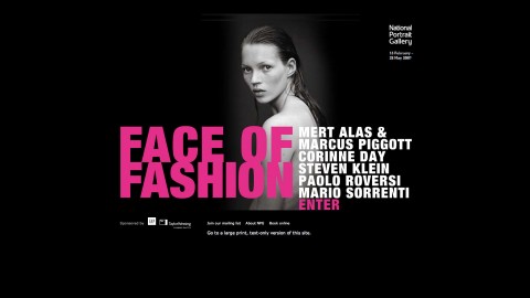
Diese Microsite ist als Ergänzung zu den Basisdrucksachen entwickelt worden, um die Ausstellung von Fotofotografien zu promoten und die National Portrait Gallery einer jüngeren Zielgruppe näher zu bringen. Die Site vermittelt nicht nur...

Integrität

Die Jury hebt das geschlossene, übergreifende Konzept hervor, in dem ien durchgängiger Gestaltungsgedanke klar visualisiert ist.
Designpreis Brandenburg
OVG Oberhavel Verkehrsgesellschaft Erscheinungsbild
Project

OVG Oberhavel Verkehrsgesellschaft Erscheinungsbild

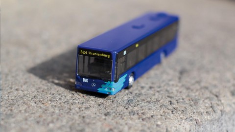
Für die Oberhavel Holding und ihre drei Tochtergesellschaften wurde eine Zeichenfamilie entwickelt, um Vertrauenswürdigkeit und Effizienz zu vermitteln. Das OVG-Logo spiegelt die neu errungene Dynamik der Verkehrsgesellschaft wider. Die...

Meisterhaft

Thomas Manss’ meisterhafte Layouts sind reich an zurückhaltendem Feinsinn.
Gabriele Bramante, Architekt
Tadao Ando, The Colours of Light, Phaidon Press
Project

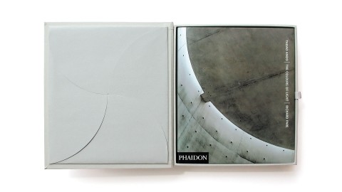
Tadao Ando, The Colours of Light, Phaidon Press

Der japanische Architekt Tadao Ando ist bekannt für die ausgesuchten Materialkontraste sowie das Licht und die Atmosphäre in seinen Bauten. Der Fotograf Richard Pare hat in seinen fotografischen Rundgängen versucht, die Quintessenz der...
Steve McCurry, South SouthEast, Phaidon Press
Project

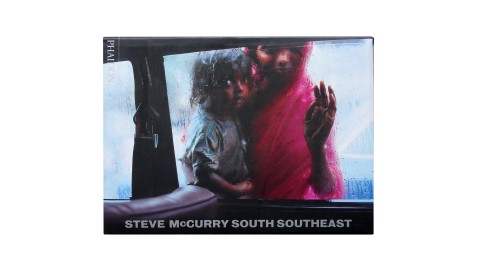
Steve McCurry, South SouthEast, Phaidon Press

Im Phaidon Verlag ist diese Sammlung von Aufnahmen und Anekdoten des Magnum-Fotografen Steve McCurry erschienen, der seit Jahren Reportagen für das National Geographic Magazin fotografiert. Das großzügige Format entspricht den Proportionen...
Salon 2012, Kulturverlag Polzer
Project

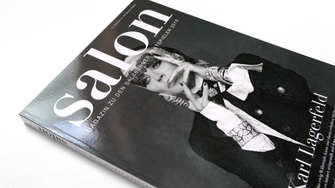
Salon 2012, Kulturverlag Polzer

Die 2012er Ausgabe des Salon Magazins präsentiert ein stark verändertes Festspielprogramm initiiert durch den neuen Festspieldirektor Alexander Pereiera. Zusätzlich zu den Berichten über Opern- und Theateraufführungen mit Stars wie Cecilia...
McLaren - The Art of Racing, Prestel Verlag
Project

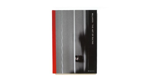
McLaren - The Art of Racing, Prestel Verlag

In 'The Art of Racing' verschwimmen die Grenzen zwischen Motorsport und Kunst. Das Buch erzählt mit aufwändig reproduzierten Fotografien von Darren Heath und dem Expertenwissen des langjährigen Motorsport-Kommentators Maurice...

Medien

Während der engen Zusammenarbeit mit Thomas Manss & Company war ich fortwährend von ihrer Fähigkeit beeindruckt, die gleiche Botschaft in vollkommen andere Medien zu übersetzen.
Daniel Haikin, Bowers & Wilkins
Bowers & Wilkins Erscheinungsbild
Project

Bowers & Wilkins Erscheinungsbild

Die langjährige Zusammenarbeit mit dem Lautsprecherhersteller B&W führte zu dem Aufbau eines kontinuierlichen Markenauftritts über einen Zeitraum von nunmehr 15 Jahren. Die fortlaufende Entwicklung der Kommunikationsstrategie führte...
Bowers & Wilkins auf der CES Las Vegas
Project

Bowers & Wilkins auf der CES Las Vegas

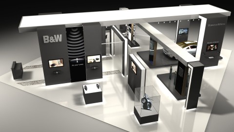
Für den Audiohersteller Bowers & Wilkins ist die Unterhaltungselektronik Show CES in Las Vegas die wichtigste saisonale Veranstaltung, wenn es um die Einführung neuer Produkte geht. Im Rahmen der Einführung des Audiosystems für Autos...
Bowers & Wilkins Zeppelin Kampagne
Project

Bowers & Wilkins Zeppelin Kampagne

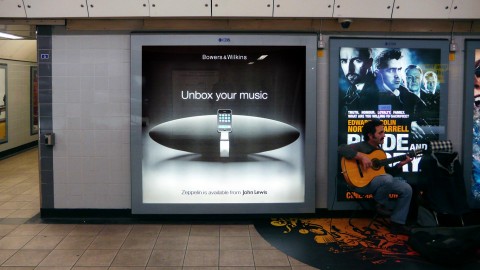
Die erste iPod-Docking-Station von Bowers & Wilkins ist mit einem zielgerichteten Feuerwerk über alle Medien eingeführt worden. Die Kampagnen-Headline „Unbox Your Music“ beschreibt nicht nur die besondere Form des Zeppelins,...
Seven Notes World Tour 2013
Project

Seven Notes World Tour 2013

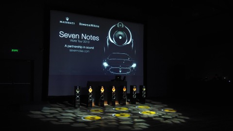
Für seine Liebhaber hört sich der Motor eines Maserati wie Musik an. Die Ingenieure aus Modena sind sogar überzeugt, dass das Auto sieben eindeutige Töne erzeugt. Dieser musikalische Zusammenhang war der Ausgangspunkt für eine Sound-...

Erzähler

Thomas Manss & Company sind Designer, zugleich — und viel wesentlicher — auch Erzähler, Mythenmacher und Dramatiker.
Conway Lloyd Morgan, Autor und Designkritiker
Meoclinic Erscheinungsbild
Project

Meoclinic Erscheinungsbild

Das Erscheinungsbild der Meoclinic unterscheidet sich stark von den Minimallösungen, die in dieser Branche üblich sind. Der elegante, kalligrafische Phönix im Mittelpunkt des Meoclinic Erscheinungsbildes gilt als universelles Symbol der...
Mindseye Website
Project

Mindseye Website

Die neue Website für das Lichtplanungsunternehmen Mindseye ist die probate Online-Bühne, um die umfangreichen Arbeitsbeispiele der Londoner Lichtberater wirkungsvoll in Szene zu setzen. Das Portfolio, das Lichtlösungen für den Künstler...
Fedrigoni Jahresbericht 125
Project

Fedrigoni Jahresbericht 125

Wer behauptet eigentlich, dass Jahresberichte von der Darstellung der gesetzlich vorgeschriebenen Finanzinformationen dominiert werden müssen? Bei dem diesjährigen Fedrigoni Jahresbericht handelt es sich um eine ganz besondere Publikation...
Moving - Norman Foster on Art
Project

Moving - Norman Foster on Art

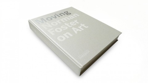
Vor über 20 Jahren entwarf Norman Foster das Carré d’Art in Nîmes und feiert nun mit der Ausstellung „Moving – Norman Foster on Art”, die er zum 20. Jubiläum des Museums kuratiert hat, eine spektakuläre Rückkehr nach Südfrankreich. Das...

Ordnung

Wo sonst findet man solch tadelloses Britentum bei einem Deutschen, der in London und Berlin arbeitet und es dabei schafft, die Tugenden beider Kulturen ohne ihre Unarten zu besitzen.
Mark Adams, Vitsœ

Read more …

Teutonic Ordnung or English Excentricity – Vitsoe's Mark Adams finds them both.

Vitsoe’s customers are discerning. They are frequently international people who have been widely exposed to the best that this world has to offer. Moreover, they are not fooled easily. Hence the manner in which we communicate with these individuals is of paramount importance to us.

To complicate matters, we need a teutonic sense of ordnung whilst longing for a splash of English eccentricity. And naturally we want to deal only with the most professional suppliers but we want to have some fun in the process; and we want to see our money spent on talent, creativity and experience – our egos do not need to be massaged by the delusion of unnecessarily excessive overheads. For many years we have worked with celebrated – and not so celebrated – graphic designers in search of a company which would be able to accommodate our strict requirements.

Fortunately, in 1993 our lifelong subscription to Design Week was justified by a single issue when we were alerted to the creation of Thomas Manss & Company. From a simple folded card (designed and printed in ten days) we have progressed through a series of complex technical literature (lots of ordnung), via award-winning exhibition design, to arrive at our most recent project together – the sexy bit. And what fun we have had. 36 colour pages photographed in numerous locations, produced on-time, to-budget and now bringing home the results. As the photographer Ken Kirkwood subsequently commented, “Its final success is due almost entirely to the symbiosis of like minds.”

The pundits tell us that Thomas Manss & Company does not fit into a recognisable graphics category. We can see why. Where else can one find such impeccable Englishness in a German who lives and works in London and Berlin, and manages to possess the virtues of both cultures without the vices? Perhaps it is the process of Fletcherisation on a receptive German mind that yields such fruitful results.

Mark Adams

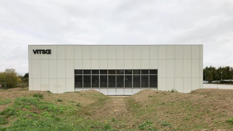
Vitsœ in Leamington Spa
Project

Vitsœ in Leamington Spa

Der Hauptsitz des Mőbelherstellers Vitsœ in Royal Leamington Spa zeigt das gleiche flexible Systemdenken, das den von Dieter Rams entworfenen Möbeln des Unternehmens zu eigen ist. Das Gebäude beherbergt die Produktion, Verwaltung,...
Vitsœ Erscheinungsbild
Project

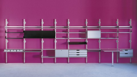
Vitsœ Erscheinungsbild

Das Vitsœ 606 Universal Regalsystem wurde 1960 vom Braun-Designer Dieter Rams entworfen – und wird immer noch nahezu unverändert produziert. Im Rahmen der Überarbeitung des Gesamtauftritts wurden alle Unternehmenspublikationen...
Vitsœ Installation and Beyond
Project

Vitsœ Installation and Beyond

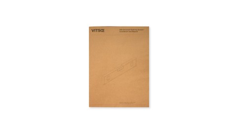
Installation and Beyond ist der letzte von drei Schritten, die zum Status eines Vitsœ Besitzers führen. Nach der Produktbroschüre für Dieter Rams' 606 Universal Regalsystem und dem Planning Guide, führt Installation and Beyond den...
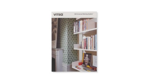
Vitsœ Produktbroschüre
Project

Vitsœ Produktbroschüre

Zusammen mit der Vitsœ Website bildet die Produktbroschüre den ersten von drei Schritten bis man sich als Besitzer eines legendären 606 Universal Regalsystems von Dieter Rams bezeichnen darf. Langjährige Kunden können die Vitsœ-Story am...
Vitsœ Ausstellungen
Project

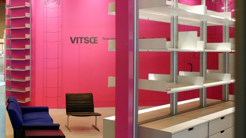
Vitsœ Ausstellungen

Das Vitsœ 606 Universal Regalsystem wurde 1960 vom Braun-Designer Dieter Rams entworfen – und wird immer noch nahezu unverändert produziert. Thomas Manss & Company hat den preisgekrönten Vitsœ-Stand auf der „Spectrum and 100%Design“...

Organisiert

Alles ist bestens geordnet. Dieter Rams’ Vitsœ Regale kleiden die Wände und große fünfbeinige Zeichen- und Bürotische, die Manss selbst aus blau beschichteten Span- platten gefertigt hat, stehen im Raum.
Hugh Pearman, Autor und Designkritiker
Vitsœ Kampagne
Project

Vitsœ Kampagne

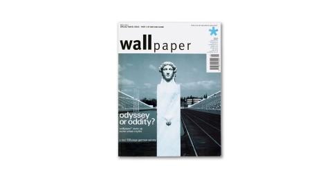
Die Design affine Leserschaft des Wallpaper Magazins ist die perfekte Zielgruppe für eine Reihe von Anzeigen für Dieter Rams' 606 Universal Regalsystem. Die Darstellung unter Verwendung moderner Wandfarben führt dabei regelmäßig zu...
Vivité Erscheinungsbild
Project

Vivité Erscheinungsbild

Tag für Tag stehen Ärzte überall auf der Welt vor der Herausforderung für Ihre Patienten medizinische Entscheidungen treffen zu müssen, ohne über deren medizinische Vorgeschichte Bescheid zu wissen. Vivité Gründer Dr. Eckhard Löhde...
Kitaj Prints - Ein Catalogue Raisonné
Project

Kitaj Prints - Ein Catalogue Raisonné

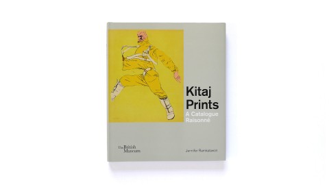
„Betrachtet man Kitajs frühen Drucke fast 50 Jahre nach ihrem Entstehen, so staunt man, wie gewagt, erfrischend, geistreich und prägnant die Werke sind. Es besteht kein Zweifel, dass sie mit verdeckten Hinweisen gespickt sind und genau das...

Qualität

Es ist eine Freude an so zahlreichen schönen Projekten zu arbeiten, deren Qualität und Zeitplanung stets hervorragend ist.
Chiara Medioli, Fedrigoni
Fedrigoni Top Award
Project

Fedrigoni Top Award

Fedrigonis Top Award ist ein Muss für jeden Designer, Drucker und Verleger, der etwas auf sich hält. Für das 125. Jubiläum von einem der ältesten Papierhersteller Europas kehrt die feierliche Veranstaltung zu den Wurzeln typografische...
Fedrigoni Cartiere Website
Project

Fedrigoni Cartiere Website

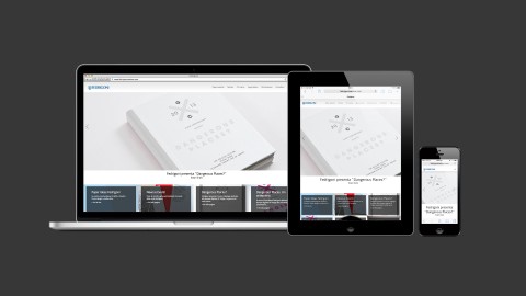
Als Thomas Manss & Company für die Neugestaltung der Website des größten Papierherstellers Italiens angefragt worden ist, war Fedrigonis Online-Kommunikation fragmentiert. Die Fedrigoni Website enthielt Informationen zu Unternehmen und...
Fabriano Cocktail Papiermuster
Project

Fabriano Cocktail Papiermuster

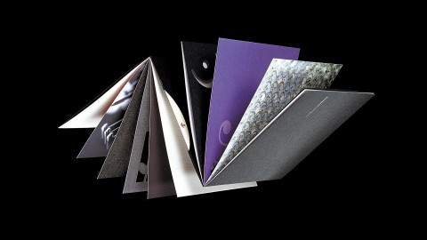
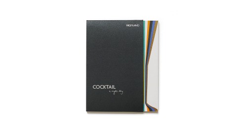
Musterbücher sind für die Papierindustrie wie Brühwürfel zum Kochen – nützlich, aber wenig inspirierend. Das Musterbuch für das Cocktail-Sortiment von Fabriano kombiniert einen klassischen Fächer mit allen Papieren dieses Sortiments, und...
Fedrigoni Top Award 2017
Project

Fedrigoni Top Award 2017

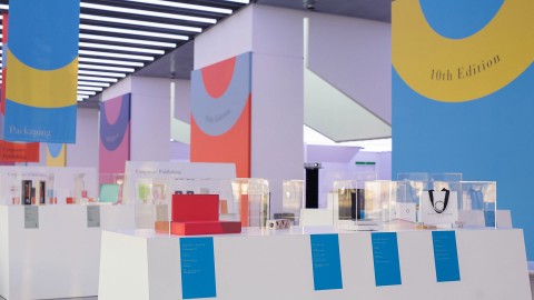
Alle zwei Jahre bietet der Fedrigoni Top Award ist eine Bestandsaufnahme des zeitgenössischen Designs in fünf Druckkategorien: Verpackungen, Etiketten, Corporate Publishing, Indigo Digitaldruck und Bücher. Aufgrund der wachsenden...

Auffälligkeit

Niemand kann Thomas Manss ‘unauffälliges’ Design vorwerfen.
Simon Heptinstall, Journalist

Read more …

Numero Uno.

Simon Heptinstall examines current thinking on letterhead design.

The Design council spokeswoman laughed when I explained that I wanted to speak to letterhead experts. “I wonder if there is anyone who doesn’t mind being associated with that,” she scoffed. “It must be quite a limiting field.” Ironically, she promptly faxed me a list of contacts on Design Council stationery – which features a three-deck, 24pt, 18-word slogan right across the top of the page. Nothing limiting about that.

“It’s simple, effective and appropriate,” said Aziz Cami. “It’s a manifestation of what the Design Council does: galvanise, orchestrate and evangelise. They are a special organisation which has been radically re-shaped. Their letterhead needs to challenge conventions. “The easiest thing to do would have been to come up with a fancy twisted logo – but a letterhead can do so much more than look clever. The role for a letterhead as a variable campaigning headline is new. Different businesses have used varied colour schemes for different letters but nothing like this. And they can change the words in six months time if they want to be lower key or tackle a single issue.” So is this likely to launch a new fashion? Cami predicts that…clients will increasingly demand effectiveness not decoration. Justus Oehler agrees that the trend is, in effect, away form trends. “Ultimately, we give people what they need. We’ve managed to avoid the extremes of fashion to create longer-lasting designs. Their letterheads are about reliability, timelessness and correctness,” he explains. That’s the sort of attitude that riles Michael Wolff. He says that designers should aim to elevate client’ aspirations. “The trend is that people are timid at the moment. They’re worried someone won’t like their letterhead. But these big companies are generally constipated. We as designers have to put them in touch with their true potential. Huge companies can have lovely letterheads, like Apple Computers for example.”

Wolff, who I disturbed as he wrote to thank his dustman for a good year’s service, says most letters are “staggeringly dreary”. “Some design companies write to me and their letters manage to look and read like something from an 18th-century solicitor. With all today’s digital sophistication, most letters still look like they were produced on a turn-of-the-century typwriter. Terence Conran wrote to me years ago when I had asked for some money for a conference or something. The letter came back an it just said: ‘Dear Micheal, No, Terence’ in huge type. It was very elegant. I have never forgotten it That’s where the Design Council’s new letterhead can score,” says Wolff. “They could say something different to individuals in that headline style. For example, it could say in big type: ’Dear Michael Wolff, Can I have my cheque please?’, then the rest of the letter underneath in normal size.”

Nobody could accuse Thomas Manss of “quiet” design on the evidence of his letterhead for Laserbureau. This colour printing business tops its letters with a bright pattern of seemingly random words that, on second glance, reveal a message. The design is generated on an Apple Mac with Adobe Illustrator software and can be manipulated to highlight particular words. Particular services can be emphasised when appropriate. “Five years ago, the artwork alone would have taken hours to produce, not to mention the cost of printing,” says Manss. “Now with Macintosh technology and Laserbureau’s own facilities, it is a very practical solution.”

John Gorham is another designer who believes the trend is towards individualistic design. “If I knew what the fashion in letterheads was, I would react against it,” he said. “My images come from solving the problem. I create my own fashions.”

Simon Heptinstall

Fedrigoni Top Award 2017
Project

Fedrigoni Top Award 2017

Alle zwei Jahre bietet der Fedrigoni Top Award ist eine Bestandsaufnahme des zeitgenössischen Designs in fünf Druckkategorien: Verpackungen, Etiketten, Corporate Publishing, Indigo Digitaldruck und Bücher. Aufgrund der wachsenden...
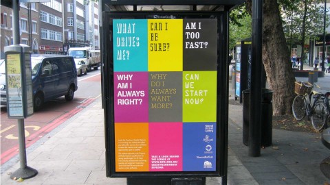
Verkehrsverbund Berlin Brandenburg Poster
Project

Verkehrsverbund Berlin Brandenburg Poster

Der ursprüngliche Auftrag des VBB lautete, das Foyer der Hauptverwaltung freundlicher zu gestalten. Daraus entwickelte sich die Idee einer Reihe von Plakaten, die daraufhin sogar als Präsente für Besucher und VIPs genutzt wurden. Es wurden...
Fedrigoni auf der Luxe Pack Monaco
Project

Fedrigoni auf der Luxe Pack Monaco

Alle zwei Jahre trifft sich die Welt der Verpackungshersteller auf der Luxe Pack Monaco zu einer Bestandsaufnahme der globalen Trends im Bereich der Luxusverpackungen. Da darf die Fedrigoni Gruppe natürlich nicht fehlen. Der italienische...
Creative & Media Diploma Promotion
Project

Creative & Media Diploma Promotion

Zum Launch ihrer Website zum Creative and Media Diploma – einem Ausbildungsgang für 14- bis 17-jährige Schüler – beauftragte die National Portrait Gallery Thomas Manss & Company mit einer Einführungskampagne für Schüler und Lehrer.

...

Reputation

Manss ist ein ziemlich bekannter Buchdesigner, was nicht überrascht, wenn man sieht, wie gut seine Bücher sind. Seine Herangehensweise an die Gestaltung eines Architekturbuches, das ich für Phaidon schrieb, hat mich sehr beeindruckt.
Hugh Pearman, Autor und Designkritiker
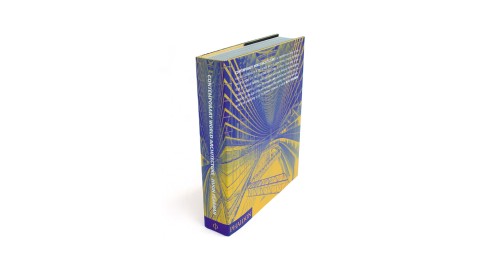
Contemporary World Architecture, Phaidon Press
Project

Contemporary World Architecture, Phaidon Press

Dieses Projekt gab uns die Gelegenheit, nicht nur das Buch, sondern auch alle verkaufsfördernden Maßsnahmen dazu gestalten zu können. „Contemporary World Architecture“ bietet eine komplette Übersicht der Weltarchitektur von 1970 bis heute...
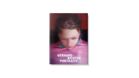
Gerhard Richter Portraits, National Portrait Gallery
Project

Gerhard Richter Portraits, National Portrait Gallery

Die National Portrait Gallery London zeigte im Jahr 2009 Bilder des Malers Gerhard Richter. Begleitend hierzu wurde der Ausstellungskatalog entwickelt, der – ebenso wie die Ausstellung – tiefgreifende Aspekte Richters Arbeit beleuchtet und...
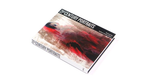
21st Century Portraits, National Portrait Gallery
Project

21st Century Portraits, National Portrait Gallery

Laut Andrew Graham-Dixon, „wird Porträtkunst oft als eine in der Vergangenheit verhaftete Kunstform abgetan“. Dabei zeigt die Bestandsaufnahme der National Portrait Gallery von Porträts des 21. Jahrhunderts „eindeutig (und vielleicht...
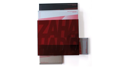
Zaha Hadid, Thames and Hudson
Project

Zaha Hadid, Thames and Hudson

Die Dokumentation des Gesamtwerkes von Zaha Hadid, eine der berühmtesten zeitgenössischen Architektinnen der Welt, besteht aus vier Bänden, die in einem rot-transparenten Acrylglas-Schuber vorgelegt werden. Die Aufgabe, eine detaillierte...

Eindeutigkeit

Auch wenn die Projekte von Thomas Manss & Company eine eindeutige Handschrift haben, so sind sie gleichzeitig beispielhaft in ihrer Vielseitigkeit.
Deborah Richardson, Objective Communications
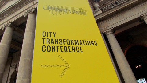
Urban Age Konferenz 2013 Rio de Janeiro
Project

Urban Age Konferenz 2013 Rio de Janeiro

„Urban Age – Das Zeitalter der Städte“ ist eine Konferenzreihe, die von der Alfred Herrhausen Gesellschaft der Deutschen Bank in Zusammenarbeit mit der London School of Economics ins Leben gerufen wurde, um bessere Lösungen für die...
Palazzo Avino Erscheinungsbild
Project

Palazzo Avino Erscheinungsbild

Der historische Palazzo Sasso hatte sich seinen Ruf als ein Gigant unter den Luxushotels an Italiens Amalfi Küste redlich verdient, als die Avino Familie sich entschied den Palazzo nach seinen stolzen Besitzern zu benennen. Ziel des neu...
Penha Longa Website
Project

Penha Longa Website

„Responsive Design“ ist der zeitgemäße Ansatz im Zusammenhang mit Website-Entwicklungen seit Ethan Marcotte diesen Begriff im Jahr 2010 geprägt hat. Mit dieser immer noch brandaktuellen Methode lassen sich Websites für alle denkbaren...
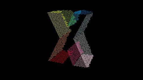
X Stories
Project

X Stories

Die British Library hat im Rahmen des London Design Festivals 26 Designer aufgefordert, mit 26 Textern zusammenzuarbeiten. Jedes Paar hatte die Aufgabe, zu einem Buchstaben des Alphabets ein Poster zu gestalten. Während des Festivals wurde...

Überraschung

Thomas Manss & Company sind gut in jeder Gestaltungsdisziplin – ob Logos, Broschüren, Jahresberichte, Ausstellungen, Bücher, Magazine oder Websites. Das Designprinzip bleibt das gleiche: es ist eine Kombination von Logik und Überraschung.
Elena Weller, Journalist
Prof-Media Zeichen
Project

Prof-Media Zeichen

The mark for Russian media conglomerate Prof-Media is an initial turned symbol. By rotating the letter M a powerful pattern emerges that is evocative of traditional broadcasting testcards.
Fedrigoni Hotel Buch
Project

Fedrigoni Hotel Buch

Für Hotels ist kein Aufwand zu groß, um seine Gäste zu verwöhnen und dieses schwer fassbare Zuhause-Gefühl zu erzeugen: von der eindrucksvollen Broschüre bis zu der persönlichen Begrüßungskarte, von der Restaurant-Speisekarte bis zu...
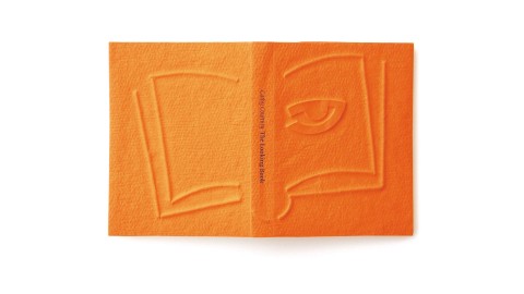
Ron King, The Looking Book, Circle Press
Project

Ron King, The Looking Book, Circle Press

Der Verlag Circle Press hat anlässlich seines dreißigjährigen Jubiläums „The Looking Book“ herausgegeben. Gleichzeitig erschien eine umfassende Retrospektive im Londoner Nationaltheater. Wie viele der limitierten Editionen des Verlages...
Wirtschaftsministerium Brandenburg Technologie Kampagne
Project

Wirtschaftsministerium Brandenburg Technologie Kampagne

Nach der deutschen Wiedervereinigung benötigte das Land Brandenburg eine Strategie für das Technologiemarketing, um das Entwicklungspotential der Region bekannt zu machen. Es wurden drei Plakatmotive, um die wichtigsten Vorzüge der Region...