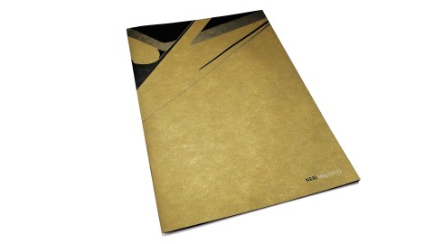

Neri Logotype
Description
Neri Logotype
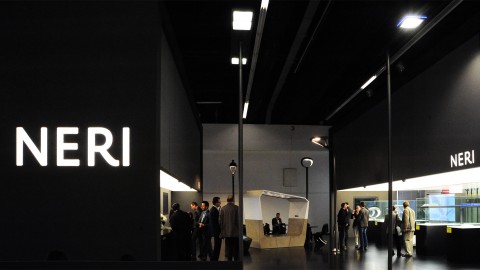
The original Neri mark with its traditional serif typeface and leafy ornament was steeped in the company's historic focus on cast iron lamps. When a product and identity review repositioned the firm in a more contemporary fashion, the task was to keep as much of the equity that had been built up in the existing mark, yet present a truly modern face to what is arguably one of the most discerning audiences: architects and designers.
The letter shapes of the Thomas Manss & Company designed logotype hark back to the classical proportions of the letters found on Rome's Trajan column. The quest for continuity satisfied, the mark goes about captivating its designer target with a clean sans serif style.
Client information
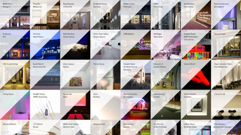
Related projects