The Museum of English Rural Life Logotype
Description
The Museum of English Rural Life Logotype
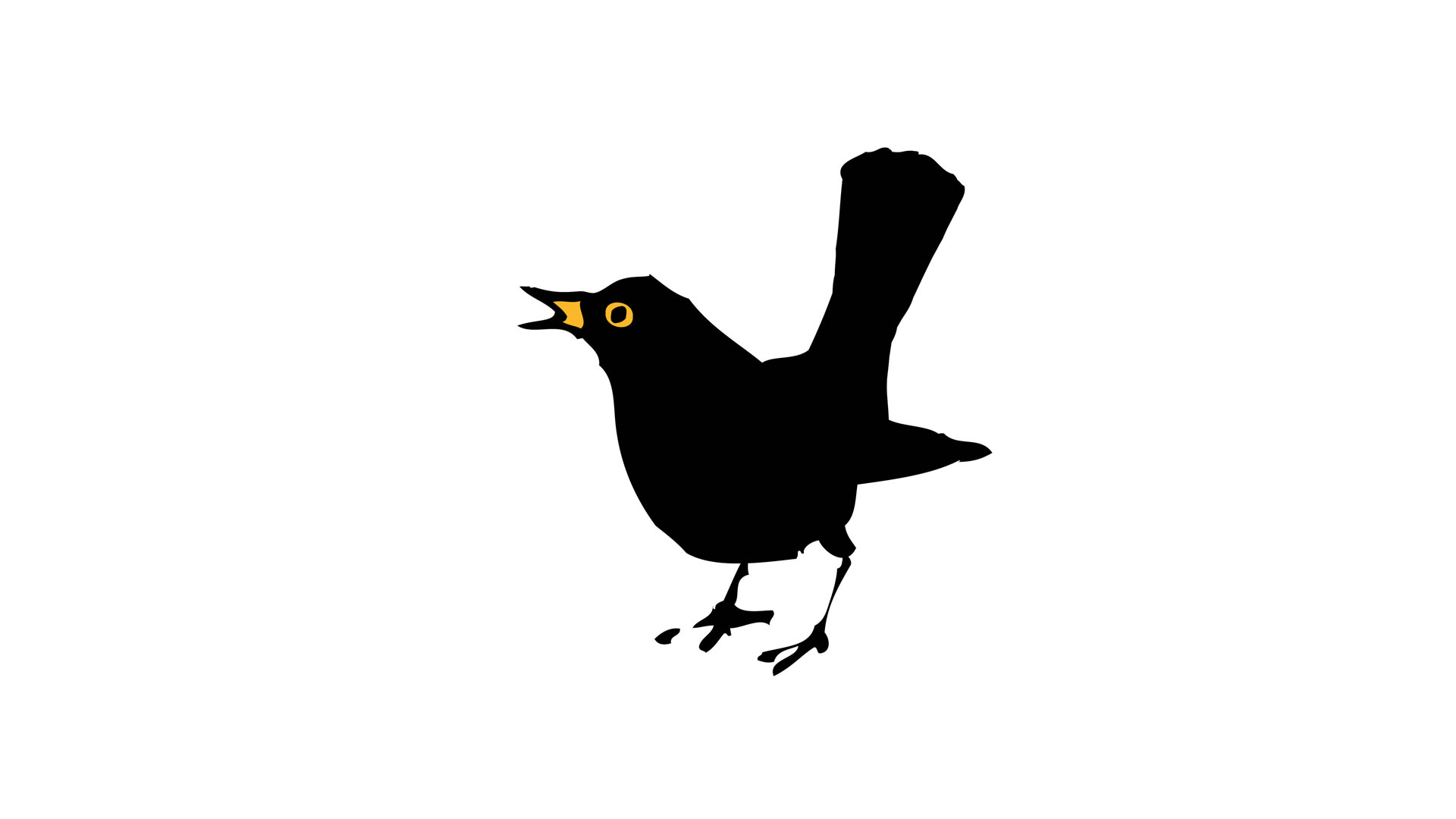
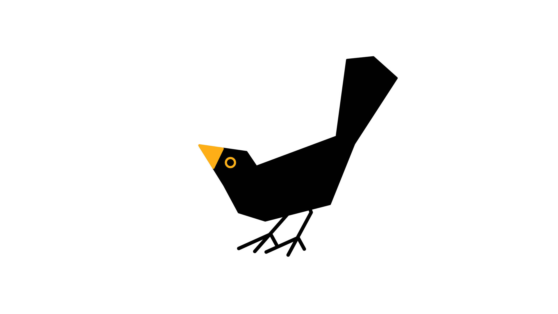
The Museum of English Rural life launched its new galleries and freshly curated display of the collection with a new logotype. The ‘M’ monogram is inspired by the common European blackbird. With its iconic black plumage, yellow bill and upturned tail the adult male is an instantly recognisable protagonist of English rural life. A less well known name for the blackbird – the merl – also happens to spell out the acronym of the Museum’s name: M-E-R-L.
The bird’s ‘merl’ moniker has its origins in Anglo-French and Middle English, from the Latin merula. It also translates as blackbird in other European languages: merle in French, mirlo in Spanish and merlo in Italian.
Client information
Related projects