• Thomas Manss & Company
    • Home
    • Clients
      • A-Z
      • Architecture
      • Arts & Culture
      • Consultancies
      • Design & Living
      • Public Service
      • Publishing
      • Service Industry
      • Technology
      • Transport
      • Well-being
    • Projects
      • Identity Programmes
        • All
        • Bowers & Wilkins
        • Bowers & Wilkins New Media
        • FH Brandenburg
        • Foster + Partners
        • Hotel Arts Barcelona
        • Marchese Antinori
        • Neri
        • Oberhavel Verkehrsgesellschaft
        • Oyuna
        • Palazzo Avino
        • Photographic Portrait Prize
        • The Merl
        • Vivité
      • Symbols & Logotypes
        • All
        • AIMA
        • Bettine-von-Arnim
        • Beuse
        • Depken & Partner
        • Giardini del Fuenti
        • Hamburg School of Ideas
        • Lill
        • Meoclinic
        • Oxford PV
        • Oyuna
        • Pat Prudente
        • The Merl
        • Val Taylor
        • VCC Perfect Pictures
      • Websites
        • All
        • Adorno Magazine
        • Chris Dyson
        • Datatrain Cockpit
        • EDSA
        • Fedrigoni Group
        • Fedrigoni Paper Selector
        • Foster + Partners
        • Mindseye
        • Oxford PV
        • Palazzo Avino
        • PRSArchitects
        • Studio Fuksas
      • Corporate Print
        • All
        • Arjo Creative Papers
        • ATeNe Dictionary
        • B&W 700 Series
        • Bowers & Wilkins 800 D3
        • Fedrigoni Hotel Book
        • Fedrigoni Imaginative Whites
        • Fedrigoni Metallic Papers
        • Fedrigoni Report 125
        • Fedrigoni Report 2016
        • FNT Magazine
        • National Portrait Gallery Guide
        • The Power of Good Design
        • Vitsœ Installation
      • Books
        • All
        • 21st Century Portraits
        • A Bouquet of Colours
        • Dymaxion Car
        • Eduardo Chillida
        • Foster 40
        • Foster Works
        • Gerhard Richter
        • Havana – Autos & Architecture
        • Hodder + Partners
        • McLaren - The Art of Racing
        • Moving
        • O Carnaval de Pixinguinha
        • Patrick Heide Ten Years
        • Photographic Portrait Prize
        • Zaha Hadid
      • Magazines
        • All
        • Art Quarterly Magazine
        • Bound by Sound
        • British Museum Magazine
        • C Photo
        • C Photo Venice
        • Infocus
        • JMP Journal
        • Martin Parr Journal
        • Neri Magazine
        • Salon 2007
        • Salon 2010
        • Salon 2011
        • Salon 2012
        • Vitsœ Voice
      • Campaigns & Posters
        • All
        • Arjo Wiggins Yearling
        • Bachchor Gütersloh
        • Bowers & Wilkins Zeppelin
        • CIM Database 10 Direct Mail
        • Creative & Media Diploma
        • Face of Fashion
        • Fedrigoni Century
        • Gerhard Richter
        • Gilò
        • Hotel Arts Christmas
        • Maserati Trofeo Series
        • Norman Foster Film
        • Photographic Portrait Prize
        • X Stories
      • Exhibitions & Signage
        • All
        • Bowers & Wilkins at 50
        • Cannon Bridge House
        • Deloitte
        • Fedrigoni Luxepack 2019
        • London Remembrance Gallery
        • Reichstag Museum of Spaces
        • Seven Notes Tour
        • Somerset House
        • Tate Modern
        • The Crime Museum Uncovered
        • The Merl
        • Top Award 2017
        • Top Award 2019
        • Urban Age 2013 Rio
        • Vitsœ Leamington
    • Publications
      • All
      • 20 Years
      • Alphabet Book
      • Business Guide
      • Capitals of Europe
      • Characters and other types
      • Chinese Whispers 2.0
      • Colours speak all languages
      • Design Harmony
      • Design: Thomas Manss & Company
      • Designers & Storytellers
      • Favourite Moments
      • Forgotten Inventions
      • HomeSapiens Magazine
      • London Berlin
      • Olympic curiosities
      • Ordnung & Eccentricity
      • Pairs
      • The World of Economics
      • Thinking Traps
      • Untranslatables
    • About us
      • What we do
      • Team
        • All
        • Cameron Armstrong
        • Adele Bacci
        • Cristina Giménez
        • Andrew Hinds
        • Masafumi Inaba
        • Thomas Manss
        • Matt Watt
        • Matthias Berg
      • Thoughts on Design
      • Opinions
    • Contact
    • Legal & Privacy Notice
Tools
Follow us
  • Facebook
  • Twitter
  • LinkedIn
enSwitch language
  • Deutsch
  • Italiano
  • Español
Search

In our projects we focus on telling meaningful stories rather than just engineering pretty layouts. This approach has attracted critical acclaim from clients, journalists and design critics alike.

Carnival
Top Ten
Twist
Colour
Education
Fun
Humour
Impact
Integrity
Masterful
Media
Narrators
Ordnung
Organised
Quality
Quiet
Reputation
Single-minded
Surprise

Carnival

The result is a riot of words and colours jostling with each other for attention, like a carnival in a paint factory.
Steve Shipside, Journalist

Read more …

True Colours

How do you create an effective identity when the company’s business keeps changing to stay in line with new technology? Steve Shipside examines Thomas Manss & Company’s work for Laserbureau.

“You can have all the colours you want, but don’t come back with any cool designer nonsense.” No, not Henry Ford the morning after, but Joe Brim, owner of Laserbureau, briefing a designer on the creation of an new corporate identity. Laserbureau is a technology production company servicing ad agencies, design companies and the like. The unlimited colour promised by Brim comes courtesy of Laserbureau’s in-house technology. However, if the technology removed the colour barrier, it posed a problem of its own. Where once Laserbureau was content to run out bromides, it has since embraced new technology with a passion. Encompassing all of that presented quite a chalenge to the designer, Thomas Manss. “The client said ‘We need a new logo to present what we’re doing,’ so I said ‘what are you doing?’, He replied ‘oh, that changes every four weeks.’ So a static logo would have been a problem.”

Manss doesn’t look as if he was particularly daunted by this. He first came to the attention of Laserbureau as a customer. He clearly made an imression because a year and a half later they called him to ask if he could help with their new image. He certainly agreed that they needed one. The solution that Manss hit on was to take Laserbureau owner Joe Brim at his word, and give a feeling for the breadth of the services offered by the company. Since those services could be changed at any moment the design was intended to make it easy to adapt. The result is a riot of words and colours jostling with each other for attention, like a carnival in a paint factory. “Yes, it seemed safely outrageous… and in the end such an enthusiastic business card is perfect for Joe.” Colours were: “whatever you can do in the four colour process – there is no house colour.” Manss acknowledges that the Latin American flavour of the result may owe a little to work he did for the Hotel Arts Barcenlona, which was equally vivid. As for fonts, Futura was selected, but as Manss explains, the brashness of the design left him with little choice in that department. “I tried a few other fonts but what we needed was maximum ink coverage and you need really bold fonts for these pattern – you can’t use an nice Swift face. Futura seems the best choice for such a fat face.”

The design also had to work large or small – it’s now appeared on business cards, folders, letterheads, promotional watches, a billboard, and, most dramatically of all, on a 30 meter long banner running right across the shop fornt in London’s Crawford Street. The flexibility that lets a logo span the gamut from business cards to shop fronts is the key to this particular client’s identity. According to Manss, however, the identity probably has further evolution ahead of it if it’s to keep up. “If they have a new service the can place it in on top.”

Steve Shipside
Graphics International, London, UK

Laserbureau Identity
Project

Laserbureau Identity

At first glance Laserbureau’s identity is an eye-catching pattern of random words. A closer look reveals the firm’s services embedded in the text. By manipulating colour, pertinent information is highlighted: the name on a business card, a...
VCC Perfect Pictures Symbol
Project

VCC Perfect Pictures Symbol

The symbol for post production company VCC is a play on a 19th century optical illusion. In the original, when you spin the black and white image, its colour components are revealed. The new design turns this on its head. When the symbol...
UK Centre for Carnival Arts Symbol
Project

UK Centre for Carnival Arts Symbol

The symbol for the UK Centre of Carnival Arts has frequently been interpreted as a bird's eye view of Caribbean dancers with their colourful costumes in full swing. It has also been likened to a riot in a paint factory. Both views...

Top Ten

As part of its weekly 'The Top Brass' column ‘The Independent on Sunday' voted Thomas Manss one of the top ten graphic designers in the UK.
The Independent

Twist

Thomas Manss & Company’s designs do not pander to fleeting fashions but instead rely on a little twist to make a memorable impression.
Deborah Richardson, Objective Communications

Read more …

Being a specialist is all very well, but it won’t win you the decathlon, reckons Deborah Richardson

When asked why he became a graphic designer, Thomas Manss is inclined to quip: “I joined the shorter queue”. He qualifies this with an explanation: despite every intention of following in his parents’ footsteps and becoming an architect, seven years of study and 20-30 more years before a major project would be built had limited appeal. By a quick process of elimination – helped by a shorter line for graphic design at university registration – he found an alternative which would satisfy his inclination to solve intellectual problems visually.

The anecdote reveals a great deal: a ready wit, intuitiveness, an aptitude for paring down a problem to its essentials, quick lateral thinking and an ability to come up with a well-judged solution. In fact, it sums up the work.

If Thomas Manss & Company’s work shows a certain single-mindedness, it is no contradiction that it is exemplary in its diversity. If you liken an identity programme to a decathlon and the designer to a decathlete, you begin to get the idea. It’s no good if you can sprint well but don’t pass the muster in the shot put; likewise you won’t win any medals if your logos are masterful but the web application is weak. As a body of work, the identities, symbols and marks, promotional collateral and annual reports, exhibitions and screen designs in this book demonstrate the decathlete’s skill. They also have that extra magic that makes the performance memorable… and the client the real winner.

Deborah Richardson

Fachhochschule Brandenburg Identity
Project

Fachhochschule Brandenburg Identity

When Fachhochschule Brandenburg approached Thomas Manss & Company with the task to rejuvenate the college's identity, initial research suggested that for the 3000 students, the idyllic surroundings with their myriad waterways and...
Neri identity
Project

Neri identity

50 years is an important milestone for any company. Urban furniture and lighting manufacturer Neri SpA has decided to treat the anniversary not as an arrival, but a new departure. The company' birthday was not just celebrated with the...
Oyuna Identity
Project

Oyuna Identity

With its collection of home accessories and womenswear, Oyuna is today an established purveyor of luxury fashion – the declared aim when the company first approached Thomas Manss & Company about the development of a new identity. A...

Colour

A German designer well-known for his use of colour.
Aveleine Byrd, Journalist
Germany + Brazil 2013–2014 Identity
Project

Germany + Brazil 2013–2014 Identity

Germany and Brazil 2013–2014 is a project initiated by the German Federal Foreign Office to strengthen the ties between the two countries. A series of events in all major Brazilian cities, organised by the German Science and Innovation...
Zal Telecomunicazioni Identity
Project

Zal Telecomunicazioni Identity

The Zal promise plays with the accepted notion of a miserable experience when dealing with the telecommunications industry – and takes a different route. "Telecommunication is changing colour" hints at a much improved and...
The Benjamin Foundation Symbol
Project

The Benjamin Foundation Symbol

The Benjamin Foundation acts more like a family rather than a charity. The organisation supports people in need by building up personal relationships, aims to create an understanding through dialogue and uses counselling to empower people...

Education

Thomas Manss & Company is not a design company, it is a finishing school for aspiring graphic designers.
David Jenkins, Writer and Critic
Foster Works, Prestel
Project

Foster Works, Prestel

Foster Works is a collection of six volumes featuring Norman Foster’s complete œuvre from the early Team 4 beginnings to the latest projects. The six books are being published over a period of six years by Prestel. The Foster Works books...
Foster 40, Prestel
Project

Foster 40, Prestel

In 2007 Norman Foster celebrated 40 years of independent practice. The book features 40 of Foster's most important projects, together with 40 themes that have consistently underpinned his work. Echoing the spirit of Foster's...
Foster + Partners, Reichstag, Museum of Spaces
Project

Foster + Partners, Reichstag, Museum of Spaces

The German Reichstag “Museum of Spaces” is a permanent exhibition at the Reichstag, Germany’s parliamentary building, undertaken in conjunction with Foster + Partners. It tells the story of the Reichstag building’s evolution over the past...
Foster + Partners Identity
Project

Foster + Partners Identity

For many years the Foster + Partners identity had been based on Otl Aichers Rotis typeface. Much like Fosters architecture, the identity had inspired many young architects who were beginning to 'outfoster' the practice by using...

Fun

Serious fun is at the heart of Thomas Manss’ success.
Conway Lloyd Morgan, Author and Design Critic

Read more …

“Everything you could have nicked from that hotel, we designed,” Thomas Manss explains with a grin. The hotel is in Barcelona, with architecture by Bruce Graham and Frank Gehry, now managed by the Ritz Carlton Group. “The American developer sold the hotel to the Ritz ready to roll, with two years supply of everything – sewing kits, placeholders, menus, and so on – and we designed them all.” But then Manss is no stranger to large-scale projects. When he qualified from design school in Berlin, he went to work for the Berlin office of Sedley Place: “My first client was the German Post Office, the largest employer in Europe, which was after a new identity. The second was Volkswagen. And my friends were starting out with fun stuff – posters for art galleries, letterheads for their chums.”

In 1989 Manss moved to London, to work with Alan Fletcher at Pentagram (“I told Alan that I’d do anything – absolutely anything – except design in Neue Helvetica again”) and four years later opened his own office. An invitation back to Berlin as a visiting professor led to comissions in Germany, and the opening of a Berlin office in 1996. “We have had a lot of foreigners working here, designers from Spain and Holland, even an Zimbabwean with an Italian passport, once. I like the changes of perspective we get from contact with these different cultures – I see myself as a European, not as either British or German – no Perpetua small caps, but not everything at right angles, either.”

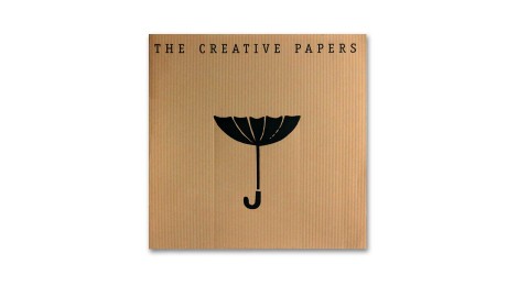
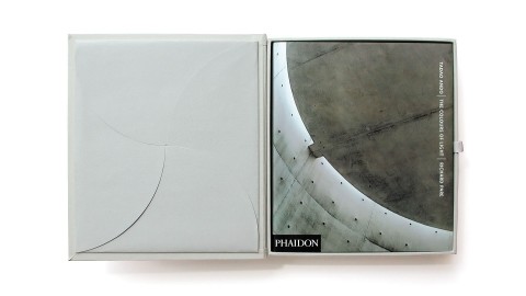
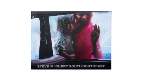
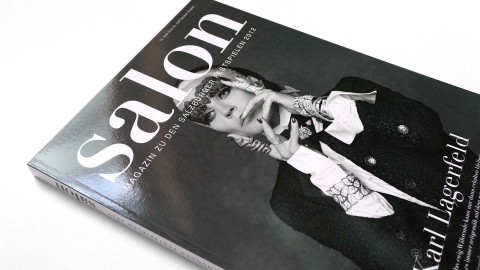
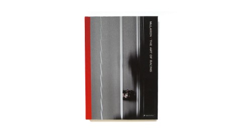
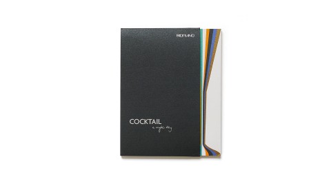
As well as travelling between London and Berlin, as Manss puts it, the company oscillates between corporate work and fun projects. Manss designed the catalogue for the Stirling Wilford exhibition at the RIBA in 1996, and again for Michael Wilford exhibition in Bilbao this year. He has also worked for Michael Hopkins and Partners, and for Nicholas Grimshaw. As well as designing several books for Phaidon, including Hugh Pearman’s recent “Contemporary European Architecture”, Manss has done a number of promotional pieces for Arjo Wiggins Fine Papers, and is currently redesigning the National Art Collection Fund magazine and Annual Report. “But we also do a lot of work for the Institut of Directors,” he points out, “and you can’t get more serious than that.”

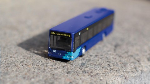
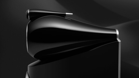
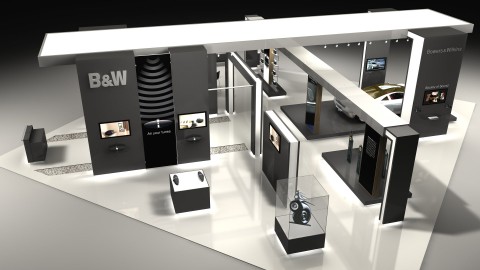
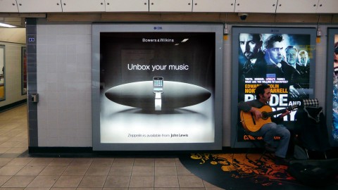
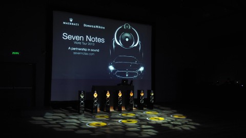
Often one corporate project leads to another: “Because of our core expertise in creating corporate identities,” he explains, “we are often seen as having a broader understanding of the company than the company itself, so we get asked to take on further tasks, such as trade fair stands and sponsored exhibitions. We recently did an identity for the Oberhavel Verkehrsgesellschaft bus company, which in turn led to stationery, then merchandising and sevice cards, and even uniforms.” With B&W, Britain’s most important loudspeaker manufacturer, it was a case of working from the bottom up. Manss was asked to create the branding for Solid, an affordable lifestyle system. His most recent work for them is the brochure for the new Nautilus 800 range: “They said it was the Aston Martin in loudspeaker design, so I modelled the brochure on a car.” Seductive photographs of details (headlamp or horn?) and expanded technical drawings, are presented on heavy A3 paper.

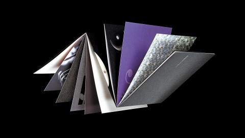
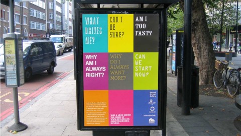
“As I see it, the designer has two tasks,” Manss explains, “the first is to resolve the problem the client has brought to you, and the second ist to make this solution desirable. Call the second part the X-factor or whatever: the way it works is that when you see the design, you want it.” How this operates can be seen in a recent project for Business Link Herefordshire and Worcestershire, a body which offers management advice and services to small and medium-sized businesses. Originally a nationwide Government agency, the service has now been passed to the private sector, in smaller local units. Herefordshire and Worcestershire came to Manss for a new brochure, to replace the previously shiny twentyfour pages of A4. According to Manss, “Business Link had a problem: despite its considerable local experience it was seen as a Government agency. And it had a problem selling it services. I pointed out that what its previous brochure did was to describe the product, not address the problem of Business Links customers. So what we set out to do was to define the real problems its clients had, and the relevant areas of expertise that Business Link had, and so device something to nice to throw away (the X-factor). It rapidly became a collaborative process, in which everyone contributed.” Manss hired a copywriter, Simon Hollingworth, to interview Business Link managers and existing customers, and commissioned a photographer, Nic Gaunt, to take portraits of clients and staff. The resulting material was repackaged, not a single brochure, but as a boxed set of ten twelve page booklets, ten by fifteen centimetres in size. Each booklet deals with a specific topic (such as Workplace, Export, or Manufacturing) and carries a question on the cover: “What do you need to do to maximise the impact of your product or service in the marketplace?” for example on the Marketing booklet. Inside, on the opening page, a broad brush description of the problems and opportunities involved, followed by a spread describing the various services Business Link can offer, then a spread of testimonials. The centre spread discusses the key issues in more detail, before a further spread of testimonials, a spread (reversed out) of comments from experts or specialised magazines on the topic, and a final page of contact details.

This is standard brochure fare, but the way it is organised – questions first, than answers, a way of saying “you” to the reader from the start, not “me” – make it quite different. The visual elements, especially the photography, are als key: the portraits of clients, full page facing the two testimonials pages, show them up to their necks in their work: the sport shoe manager in suit jacket and no trousers, the kitchen maker inside his own cupboard, not to mention the worm farmer. These introduce a lighter note, just as the extracts from magazine articles build in information and not just flannel. But the photographs also carry the message that if existing clients are happy to be portrayed in a fun way, then Business Link is, in a sense, worth taking seriously. The strong colours of the jackets, the punning logos for each booklet cover and the use of dark blue ink on the insides invite the reader in.

The booklets have already had an important influence in changing approaches to customers within Business Link, and are now much in demand by clients. They make the services offered relevant and accessible, through an elegant and economic graphic solution. A Design Effectiveness Award candidate, no doubt. And a fine example of Manss’ serious fun approach to design.

Conway Lloyd Morgan,
Graphics International, London, UK

Hotel Arts Barcelona Identity
Project

Hotel Arts Barcelona Identity

Hotel Arts Barcelona in Spain was the first foray into Europe for leading American hotel company Ritz-Carlton. When the hotel was first launched Thomas Manss & Company designed all the materials that are commonly taken by guests as a...
Arola Restaurant
Project

Arola Restaurant

Sergi Arola has made a name for himself as the proverbial rock star amongst the Michelin-starred chefs. His jeans, boots, biker rings and tattoos are not only evidence of his passion for fast machines and rock music, they also manifest his...
Ritz-Carlton Reserve Phulay Bay Website
Project

Ritz-Carlton Reserve Phulay Bay Website

The Ritz-Carlton Reserve at Phulay Bay is arguably the most beautiful luxury retreat in Thailand's Krabi region. It is the task of the resort's website to introduce this Asian beauty spot to the world at large. True to the saying...
Business Link Guides
Project

Business Link Guides

A series of small booklets called Business Guides were designed in response to a brief to enhance the perception of the Business Link organisation within the regional business community. The booklets address a variety of issues including...

Humour

Which brings us to the very nub of humour or wit in graphics; it's a valuable means of achieving an instant rapport with the audience.
Jim Davies, Author and Design Critic

Read more …

Graphic Wit in Britain and Germany.

Eccentric humour versus no humour – Jim Davies looks at the truth behind the stereotypes.

Southern Europeans stereotypically exhibit natural flair in everything they do. They eat and drink, fight and love, live and die with an uninhibited style and lustiness. Not surprisingly, this appetite for life spills over into their design. Move further northwards up the map of Europe, however, and national characteristics begin to shift. By the time you reach the less temperate climes of Germany and Britain, the vaunted excitable tendencies of the southern Europeans have all but disappeared. Where the Germans have a reputation for clinical efficiency and rigorous organisation, the British have one for shambolic eccentricity and charming self-deprecation. Though both nations have equally complex and subtle languages which lend themselves to sophisticated word play, German humour, some might argue, is a contradiction in terms. British humour, on the other hand, has a long and glorious reputation – self-flagellants each and every one, they simply can’t resist poking fun at themselves. So how do these entrenched national traits manifest themselves in graphic design?

Humour in design is an art, not a procedure. Like all jokes, the basis of graphic design humour is the unexpected – turning a letterform on its side, for instance, so that it becomes a pictogram of a table, or combining an image of a fish with an inappropriate word like “moo”. It will rarely make anyone roll about with mirth, but it may force a smile or engender a feeling of collusion between designer and audience. “Wit” or “playfulness” are perhaps better words to describe the level of humour in this context.

Thomas Manss is a German graphic designer with studios in London and Berlin, and a visiting lecturer in corporate identity at the Fachhochschule Potsdam. He is perfectly positioned to assess the differences in graphic wit apparent in the two countries. “First I will support the prejudice that Germans don’t have a sense of humour”, he says, nipping to the back of the studio to retrieve a pile of corporate identity manuals for Volkswagen, one of the first projects he worked on after leaving college.

To say they are thorough would be to do them an injustice. No stone, no grain of sand even, has been left unturned. There is a tome on the correct positioning of the VW logo in every conceivable size and manifestation; another volume on house colour; another on stationery; how to photograph your product; here’s one on corporate signage; yet another on overhead projections. But the manual on how to paint your factory the VW way takes the biscuit. It contains gems like “all moving parts of machines and equipment must be RAL 2001 red-orange”. Sure enough, there were very few belly laughs to be found around here.

“In bad times, it’s quite good to be German”, maintains Manss. “When times are good, you want an Italian car – ok, it may not work that well, but it looks great. When there is a recession on, you have to be sensible and play safe, so you buy a German car because you know it will be reliable however bad the weather.” The analogy, he continues, also applies to graphic design; when belts are tightened, clients prefer to avoid risk by sticking to tried and tested graphic solutions. Humour is regarded as flippant and inappropriate, and a sensible, po-faced approach to design tends to prevail. Once again, it’s time to wheel on the Germans. But there’s a twist in the tale. Manss reckons he can get away with slipping more humour into his design projects simply because he is German. “Some clients think, ‘Well, if a German thinks it’s ok, then surely we can get away with it.’” A case in point is Manss’s promotional work for British paper manufacturer Arjo Wiggins Fine Papers’ Range of Creative Papers. Opening up like an old-style 12-inch record cover, the sleeve houses a series of square cards on different types of paper. Each bears a clever visual joke, which at the same time manages to highlight a particular quality of the paper.

One of the best is on the cover itself, an inverted umbrella “for catching rain in dry countries”: Printed on a ribbed paper, the area immediately underneath the brolly has been debossed, as if it were actually stopping the rain from falling beneath it. The set of images are designed to be used by salespeople as both props and promptcards; sharing these ready-made jokes with a potential client has proved a successful tool.

Which brings us to the very nub of humour or wit in graphics; it’s a valuable means of achieving an instant rapport with the audience. Having caught their attention, the more serious business of educating, informing, or selling can begin in earnest.

Jim Davies
Print, New York, US

Arjo Creative Papers
Project

Arjo Creative Papers

Creative Papers is a collection of improbable objects to catch the attention of busy creatives, providing unlimited opportunity to demonstrate the versatility of six leading text and cover brands in one promotion. In a departure from...
Arjo Wiggins Yearling Direct Mail Campaign
Project

Arjo Wiggins Yearling Direct Mail Campaign

This direct mail campaign proved a resounding hit with its designer target audience. Promoting two ranges of Yearling papers, the internationally focused campaign comprised an identity, a “two in one” promotional booklet, paper swatches in...
Fachhochschule Potsdam Identity
Project

Fachhochschule Potsdam Identity

The identity for this German college, based on so-called emoticons, offers so many permutations that students and professors can choose an existing graphic device or create a new one to suit their personal or departmental needs. The same...

Impact

Judges described the National Portrait Gallery's Face of Fashion campaign as "very well executed, with high impact and strong stand-out". The jury was particularly impressed by its "elegance, strong use of typography and arresting use of images".
IMCA Awards (International Museum Communications Awards)
National Portrait Gallery, Face of Fashion Campaign
Project

National Portrait Gallery, Face of Fashion Campaign

Mario Sorrenti's photograph of Kate Moss was chosen as the key image to promote Face of Fashion - a major survey of fashion photography at the National Portrait Gallery. The model turned poster girl not only graced the poster campaign...
National Portrait Gallery, Face of Fashion Identity
Project

National Portrait Gallery, Face of Fashion Identity

In recent years, the National Portrait Gallery has increasingly become interested in portrait photography, and it was an exhibition entitled Face of Fashion for which Thomas Manss & Company was asked to design the catalogue. One of the...
National Portrait Gallery, Face of Fashion Microsite
Project

National Portrait Gallery, Face of Fashion Microsite

To promote this exhibition of fashion photographs and attract a younger audience to the National Portrait Gallery the traditional print based marketing was complemented by a dedicated microsite. The site not only gave a taster of the...

Integrity

The jury commended the integrity of the overall concept, that clearly visualises consistent thinking. The successful 'play with graphic constants and variables' deserves a special mention.
Designpreis Brandenburg
OVG Oberhavel Verkehrsgesellschaft Identity
Project

OVG Oberhavel Verkehrsgesellschaft Identity

A family of marks was designed to communicate the confidence and efficiency of Oberhavel Holding and its three subsidiaries. OVG’s symbol hints at the newly found dynamism of the public transport company. WfO's mark was inspired by a...

Masterful

The masterful layout by Thomas Manss is full of silent subtleties.
Gabriele Bramante, Architect
Tadao Ando, The Colours of Light, Phaidon Press
Project

Tadao Ando, The Colours of Light, Phaidon Press

The Japanese architect Tadao Ando is known for the light, colour and atmosphere of his spaces and his beautiful juxtaposition of materials. Working without the aid of artificial lighting, Richard Pare’s photographs distil this to present...
Steve McCurry, South SouthEast, Phaidon Press
Project

Steve McCurry, South SouthEast, Phaidon Press

This Phaidon collection of anecdotes and photographs from Magnum/National Geographic photographer Steve McCurry is presented as a portfolio of work. The large format pages echo the dimensions of McCurry’s original transparencies so the...
Salon 2012, Kulturverlag Polzer
Project

Salon 2012, Kulturverlag Polzer

The 2012 edition of Salon documents a much changed festival programme instigated by the new director Alexander Pereira. The performance features brim with stars including Cecilia Bartoli, Jonas Kaufmann and August Diehl. In addition to the...
McLaren - The Art of Racing, Prestel Verlag
Project

McLaren - The Art of Racing, Prestel Verlag

The Art of Racing' is a book that blurs the boundaries between motorsport and art. With lavishly reproduced photographs by Darren Heath and the expert insights of longtime motorsport commentator Maurice Hamilton, the book examines...

Media

I was constantly impressed at Thomas Manss & Company’s ability to translate the same message consistently across radically different media.
Daniel Haikin, Bowers & Wilkins
Bowers & Wilkins Identity
Project

Bowers & Wilkins Identity

The continuous relationship with loudspeaker manufacturer Bowers & Wilkins has been an opportunity to build a coherent brand identity over a period of 20 years. The ongoing development of the company's communication strategy has...
Bowers & Wilkins, CES Las Vegas
Project

Bowers & Wilkins, CES Las Vegas

For audio manufacturer Bowers & Wilkins the Consumer Electronics Show in Las Vegas is the most important seasonal event when it comes to the launch of new products. To mark the launch of the firm's car audio systems and the...
Bowers & Wilkins Zeppelin Campaign
Project

Bowers & Wilkins Zeppelin Campaign

Bowers & Wilkins' first iPod speaker system was launched with single minded fireworks across all media. The campaign headline 'Unbox Your Music' not only described the iconic shape of the Zeppelin, it was at the same...
Seven Notes World Tour 2013
Project

Seven Notes World Tour 2013

To the ears of the aficionados the engine of a Maserati sounds like music. The Modena engineers even talk about seven distinct notes the cars produce. This musical connection was the starting point for a partnership in sound between...

Narrators

Thomas Manss & Company are designers, but they are also – and more importantly – narrators, myth-makers, fabulators, tellers of tales.
Conway Lloyd Morgan, Author and Design Critic
Meoclinic Identity
Project

Meoclinic Identity

The identity for Meoclinic is far removed from the minimalist attitude usually adopted by high-tech medical facilities. The elegant calligraphic Phoenix at the centre of the Meoclinic identity would be equally understood as a symbol for a...
Mindseye Website
Project

Mindseye Website

The website for the architectural lighting consultancy Mindseye gives this London-based company the appropriate online stage to let its work shine. Its portfolio, ranging from lighting art for Damien Hirst to BMW showrooms and from a John...
Fedrigoni Annual Report 125
Project

Fedrigoni Annual Report 125

Who says that an annual report has to be dominated by the legal obligation to publish a plethora of financial information? Admittedly, this year's Fedrigoni annual report is a very special affair, the company is commemorating its...
Moving - Norman Foster on Art
Project

Moving - Norman Foster on Art

Norman Foster designed the Carré d'Art in Nîmes more than 20 years ago and celebrates a spectacular return to the South of France with 'Moving – Norman Foster on Art'; a show he curated to mark the 20th anniversary of the...

Ordnung

We need a teutonic sense of ordnung whilst longing for a splash of English eccentricity.
Mark Adams, Vitsœ

Read more …

Teutonic Ordnung or English Excentricity – Vitsoe's Mark Adams finds them both.

Vitsoe’s customers are discerning. They are frequently international people who have been widely exposed to the best that this world has to offer. Moreover, they are not fooled easily. Hence the manner in which we communicate with these individuals is of paramount importance to us.

To complicate matters, we need a teutonic sense of ordnung whilst longing for a splash of English eccentricity. And naturally we want to deal only with the most professional suppliers but we want to have some fun in the process; and we want to see our money spent on talent, creativity and experience – our egos do not need to be massaged by the delusion of unnecessarily excessive overheads. For many years we have worked with celebrated – and not so celebrated – graphic designers in search of a company which would be able to accommodate our strict requirements.

Fortunately, in 1993 our lifelong subscription to Design Week was justified by a single issue when we were alerted to the creation of Thomas Manss & Company. From a simple folded card (designed and printed in ten days) we have progressed through a series of complex technical literature (lots of ordnung), via award-winning exhibition design, to arrive at our most recent project together – the sexy bit. And what fun we have had. 36 colour pages photographed in numerous locations, produced on-time, to-budget and now bringing home the results. As the photographer Ken Kirkwood subsequently commented, “Its final success is due almost entirely to the symbiosis of like minds.”

The pundits tell us that Thomas Manss & Company does not fit into a recognisable graphics category. We can see why. Where else can one find such impeccable Englishness in a German who lives and works in London and Berlin, and manages to possess the virtues of both cultures without the vices? Perhaps it is the process of Fletcherisation on a receptive German mind that yields such fruitful results.

Mark Adams

Vitsœ in Leamington Spa
Project

Vitsœ in Leamington Spa

Vitsœ’s headquarters in Royal Leamington Spa showcase the same flexible system thinking that forms the DNA of the company’s Dieter Rams designed furniture. The building houses the furniture production, administration, marketing and...
Vitsœ Identity
Project

Vitsœ Identity

Vitsœ have been producing their core product, the 606 Universal shelving system, ever since the designs of Braun designer Dieter Rams were first launched in 1960. A fundamental re-assessment of Vitsœ’s entire graphic output, carried out...
Vitsœ Installation and Beyond
Project

Vitsœ Installation and Beyond

Installation and Beyond is the final step in a three step approach to Vitsœ ownership. Following the product literature for Dieter Rams' 606 Universal Shelving System and the Planning Guide, Installation and Beyond guides the new...
Vitsœ Product Literature
Project

Vitsœ Product Literature

Together with the Vitsœ website, the product literature is the first of three steps to ownership of Dieter Rams iconic 606 Universal Shelving System. Clients who have been enjoying the system for years are best qualified to tell the Vitsœ...
Vitsœ Trade Fairs
Project

Vitsœ Trade Fairs

Vitsœ have been producing their core product, the 606 Universal Shelving System, ever since the designs of Braun designer Dieter Rams were first launched in 1960. Thomas Manss & Company has been designing award-winning exhibition...

Organised

Things are very organised. Dieter Rams' Vitsœ shelving lines the walls: The floor is occupied by big five-legged drawing-office tables ... around which everyone sits on bent-plywood chairs with caster bases. His Berlin office has these chairs, too.
Hugh Pearman, Author and Design Critic
Vitsœ Wallpaper Advertising
Project

Vitsœ Wallpaper Advertising

Wallpaper's design conscious audience is the perfect target for a series of advertisements featuring Dieter Rams' 606 Universal Shelving System. Helped by contemporary wall colours, the system designed in 1960 is frequently...
Vivité Identity Programme
Project

Vivité Identity Programme

Day in day out doctors all over the world face the dilemma of having to make medical judgements on behalf of their patients without knowing anything about their medical history. With its online accessibility, Vivité's health document...
Kitaj Prints - A Catalogue Raisonné
Project

Kitaj Prints - A Catalogue Raisonné

Looking at Kitaj's early prints almost fifty years later, one is struck by how bold, fresh, witty and incisive they are. Undoubtedly they are riddled with obscure references, but this is what makes them so intriguing: they are like...

Quality

It is a pleasure to be working together on so many nice projects and the quality and timing of the materials you delivered is as always very very good.
Chiara Medioli, Fedrigoni
Fedrigoni Top Award
Project

Fedrigoni Top Award

Fedrigoni's Top Award is as a must for any self-respecting designer, printer and publisher. For the 125th anniversary of one of Europe's oldest paper makers, the award celebrations return to the roots of typographic excellence –...
Fedrigoni Cartiere Website
Project

Fedrigoni Cartiere Website

When Thomas Manss & Company was asked to redesign the website of Italy's largest paper manufacturer, Fedrigoni's online communication was fragmented. The Fedrigoni site was used to communicate corporate information, a site...
Fabriano Cocktail Visual Book
Project

Fabriano Cocktail Visual Book

Swatches are to the paper industry what the Oxo cube is to cooking – useful but hardly inspiring. The visual book for Fabriano's Cocktail range combines a 'waterfall' swatch of all the papers in the range with printed...
Fedrigoni Top Award 2017
Project

Fedrigoni Top Award 2017

Fedrigoni's Top Award is a bi-annual survey of contemporary design in five print categories: packaging, labels, corporate publishing, Indigo digital printing and books. Reflecting the growing international stature of the competition,...

Quiet

Nobody could accuse Thomas Manss of ‘quiet’ design.
Simon Heptinstall, Journalist

Read more …

Numero Uno.

Simon Heptinstall examines current thinking on letterhead design.

The Design council spokeswoman laughed when I explained that I wanted to speak to letterhead experts. “I wonder if there is anyone who doesn’t mind being associated with that,” she scoffed. “It must be quite a limiting field.” Ironically, she promptly faxed me a list of contacts on Design Council stationery – which features a three-deck, 24pt, 18-word slogan right across the top of the page. Nothing limiting about that.

“It’s simple, effective and appropriate,” said Aziz Cami. “It’s a manifestation of what the Design Council does: galvanise, orchestrate and evangelise. They are a special organisation which has been radically re-shaped. Their letterhead needs to challenge conventions. “The easiest thing to do would have been to come up with a fancy twisted logo – but a letterhead can do so much more than look clever. The role for a letterhead as a variable campaigning headline is new. Different businesses have used varied colour schemes for different letters but nothing like this. And they can change the words in six months time if they want to be lower key or tackle a single issue.” So is this likely to launch a new fashion? Cami predicts that…clients will increasingly demand effectiveness not decoration. Justus Oehler agrees that the trend is, in effect, away form trends. “Ultimately, we give people what they need. We’ve managed to avoid the extremes of fashion to create longer-lasting designs. Their letterheads are about reliability, timelessness and correctness,” he explains. That’s the sort of attitude that riles Michael Wolff. He says that designers should aim to elevate client’ aspirations. “The trend is that people are timid at the moment. They’re worried someone won’t like their letterhead. But these big companies are generally constipated. We as designers have to put them in touch with their true potential. Huge companies can have lovely letterheads, like Apple Computers for example.”

Wolff, who I disturbed as he wrote to thank his dustman for a good year’s service, says most letters are “staggeringly dreary”. “Some design companies write to me and their letters manage to look and read like something from an 18th-century solicitor. With all today’s digital sophistication, most letters still look like they were produced on a turn-of-the-century typwriter. Terence Conran wrote to me years ago when I had asked for some money for a conference or something. The letter came back an it just said: ‘Dear Micheal, No, Terence’ in huge type. It was very elegant. I have never forgotten it That’s where the Design Council’s new letterhead can score,” says Wolff. “They could say something different to individuals in that headline style. For example, it could say in big type: ’Dear Michael Wolff, Can I have my cheque please?’, then the rest of the letter underneath in normal size.”

Nobody could accuse Thomas Manss of “quiet” design on the evidence of his letterhead for Laserbureau. This colour printing business tops its letters with a bright pattern of seemingly random words that, on second glance, reveal a message. The design is generated on an Apple Mac with Adobe Illustrator software and can be manipulated to highlight particular words. Particular services can be emphasised when appropriate. “Five years ago, the artwork alone would have taken hours to produce, not to mention the cost of printing,” says Manss. “Now with Macintosh technology and Laserbureau’s own facilities, it is a very practical solution.”

John Gorham is another designer who believes the trend is towards individualistic design. “If I knew what the fashion in letterheads was, I would react against it,” he said. “My images come from solving the problem. I create my own fashions.”

Simon Heptinstall

Fedrigoni Top Award 2017
Project

Fedrigoni Top Award 2017

Fedrigoni's Top Award is a bi-annual survey of contemporary design in five print categories: packaging, labels, corporate publishing, Indigo digital printing and books. Reflecting the growing international stature of the competition,...
Verkehrsverbund Berlin Brandenburg Posters
Project

Verkehrsverbund Berlin Brandenburg Posters

The initial brief from VBB stemmed from the necessity having to guide visitors around their corporate headquarters close to Berlin Zoo train station. A desire to brighten up the foyer at the same time sparked the idea of a multi-purpose...
Fedrigoni at Luxe Pack Monaco 2016
Project

Fedrigoni at Luxe Pack Monaco 2016

Luxe Pack Monaco is a biennial showcase of the latest global trends in luxury packaging and a fixture on the Fedrigoni calendar. For the past years the Italian specialist paper manufacturer’s communication has been revolving around the...
Creative & Media Diploma Promotion
Project

Creative & Media Diploma Promotion

When the National Portrait Gallery launched a website as a dedicated resource for the Creative and Media Diploma, the learning team commissioned Thomas Manss & Company to create a launch campaign targeting students and their teachers...

Reputation

Manss has got a bit of a reputation as a book designer. Not surprisingly, given that his books are so good.
Hugh Pearman, Author and Design Critic
Contemporary World Architecture, Phaidon Press
Project

Contemporary World Architecture, Phaidon Press

The opportunity to design a book as well as the materials to promote it, helped ensure the high visibility of Contemporary World Architecture, a major international survey of architecture today. The book offers a comprehensive look at...
Gerhard Richter Portraits, National Portrait Gallery
Project

Gerhard Richter Portraits, National Portrait Gallery

In 2009, the National Portrait Gallery London held an exhibition of portraits by the German painter Gerhard Richter some of which had never been presented before. The exhibition focused on the early black-and-white paintings derived from...
21st Century Portraits, National Portrait Gallery
Project

21st Century Portraits, National Portrait Gallery

According to Andrew Graham-Dixon, "portraiture is often dismissed as an art form mired in the past", yet the National Portrait Gallery's survey of 21st Century Portraits "clearly (and perhaps surprisingly) demonstrates...
Zaha Hadid, Thames and Hudson
Project

Zaha Hadid, Thames and Hudson

The Complete Works by Zaha Hadid, one of the world's most celebrated architects, consists of four volumes presented in a 3-D ruby–red Lucite slipcase. The brief to design the definite overview, incorporating four volumes of differing...

Single-minded

If Thomas Manss & Company’s work shows a certain single-mindedness, it is no contradiction that it is exemplary in its diversity.
Deborah Richardson, Objective Communications
Urban Age Conference 2013 Rio de Janeiro
Project

Urban Age Conference 2013 Rio de Janeiro

The Urban Age Programme, jointly organised by Deutsche Bank’s Alfred Herrhausen Society and the London School of Economics is an international investigation of the spatial and social dynamics of cities. Following events in New York, Berlin...
Palazzo Avino Identity
Project

Palazzo Avino Identity

The historic Palazzo Sasso had earned its reputation as a luxury giant among the hotels along Italy's Amalfi coast, when the Avino family finally decided to grace their pride and joy with their family name. The new symbol was designed...
Penha Longa Website
Project

Penha Longa Website

'Responsive design' has been the thinking man's approach to website development ever since Ethan Marcotte coined the phrase in 2010. Still a much-hyped topic today, 'responsive design' let's you create...
X Stories Poster
Project

X Stories Poster

As part of The London Design Festival the British Library asked 26 Designers to collaborate with 26 writers. Each pair had to design a poster dedicated to one letter of the alphabet. An exhibition of all the posters was held at the British...

Surprise

Thomas Manss & Company are good at designing anything: logos, brochures, annual reports, exhibitions, books, magazines and websites. The design formula remains unchanged: it's a combination of logic and surprise.
Elena Weller, Journalist
Prof-Media Symbol
Project

Prof-Media Symbol

The mark for Russian media conglomerate Prof-Media is an initial turned symbol. By rotating the letter M a powerful pattern emerges that is evocative of traditional broadcasting testcards.
Fedrigoni Hotel Book
Project

Fedrigoni Hotel Book

To create that elusive home-from-home feeling, hotels go to great lengths to indulge their guests: from the lavish brochure to a personal note on arrival, from restaurant menus to shampoo packaging, every impression counts. It is...
Ron King, The Looking Book, Circle Press
Project

Ron King, The Looking Book, Circle Press

The Looking Book celebrates the thirtieth anniversary of the Circle Press and coincided with a major retrospective called “Through the Looking Book” at the National Theatre. Like many of the limited edition artists’ books published by this...
Wirtschaftsministerium Brandenburg Technology Marketing
Project

Wirtschaftsministerium Brandenburg Technology Marketing

After the re-unification of Germany, the Land Brandenburg needed an identity and marketing strategy to communicate the enormous potential the region has for industrial development. Three posters were created to convey the region’s core...